


INTRODUCING GLENVILLE AVE - OUR NEWEST HAYMOUNT HOME
Welcome to the home tour of our newest Haymount Home!
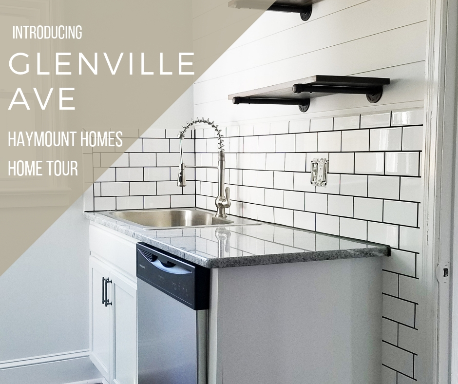
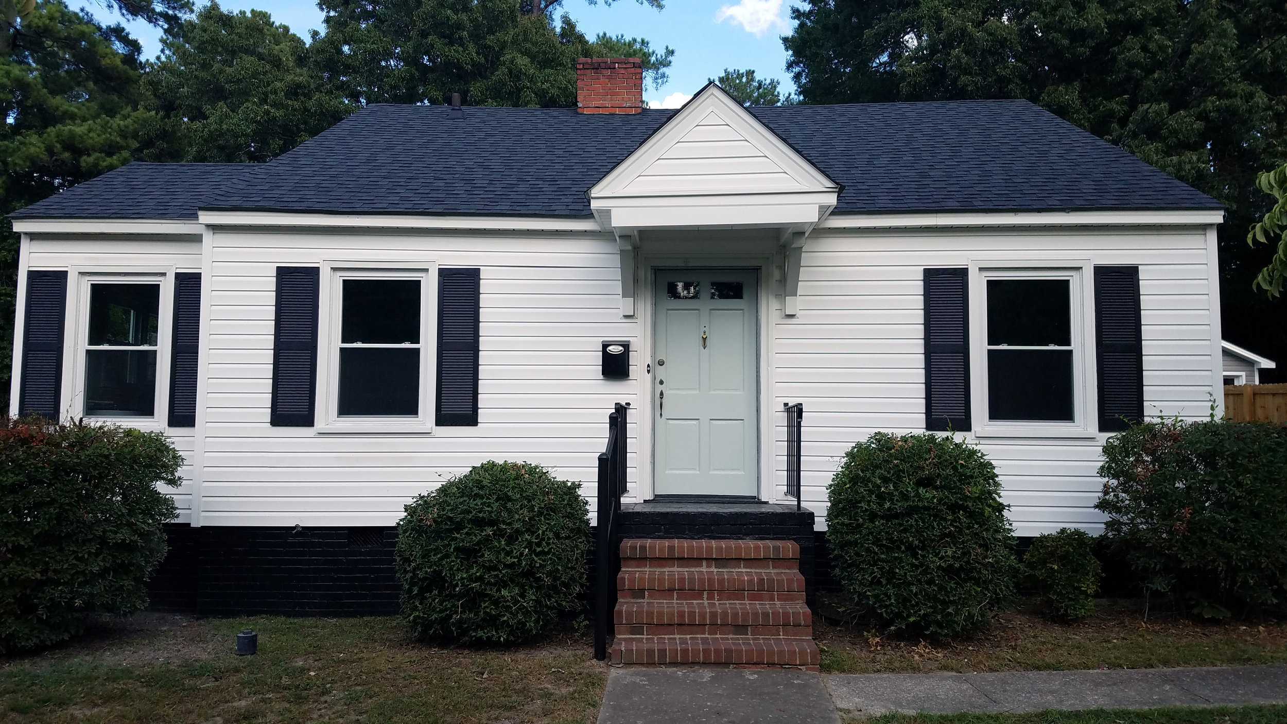
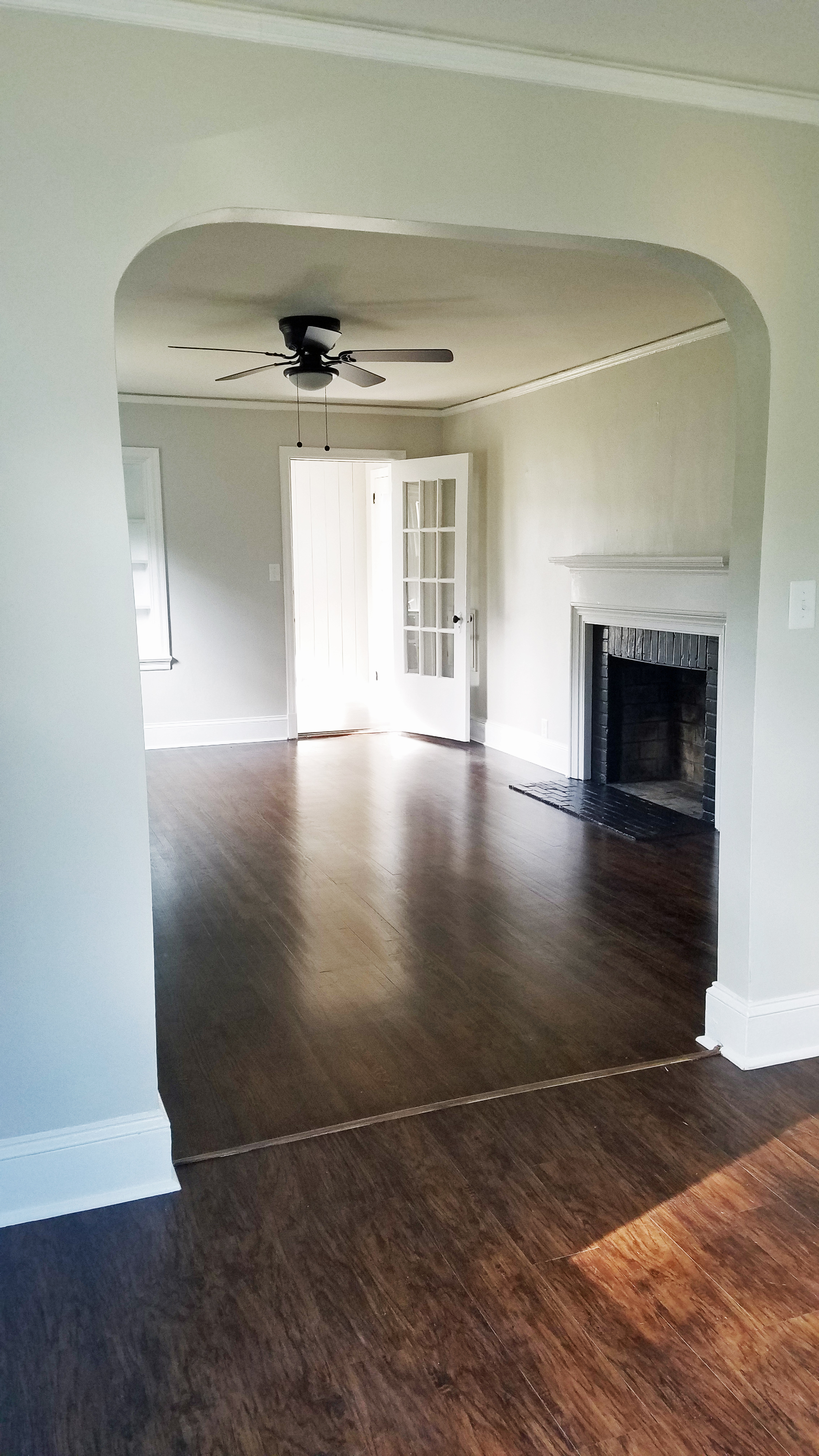
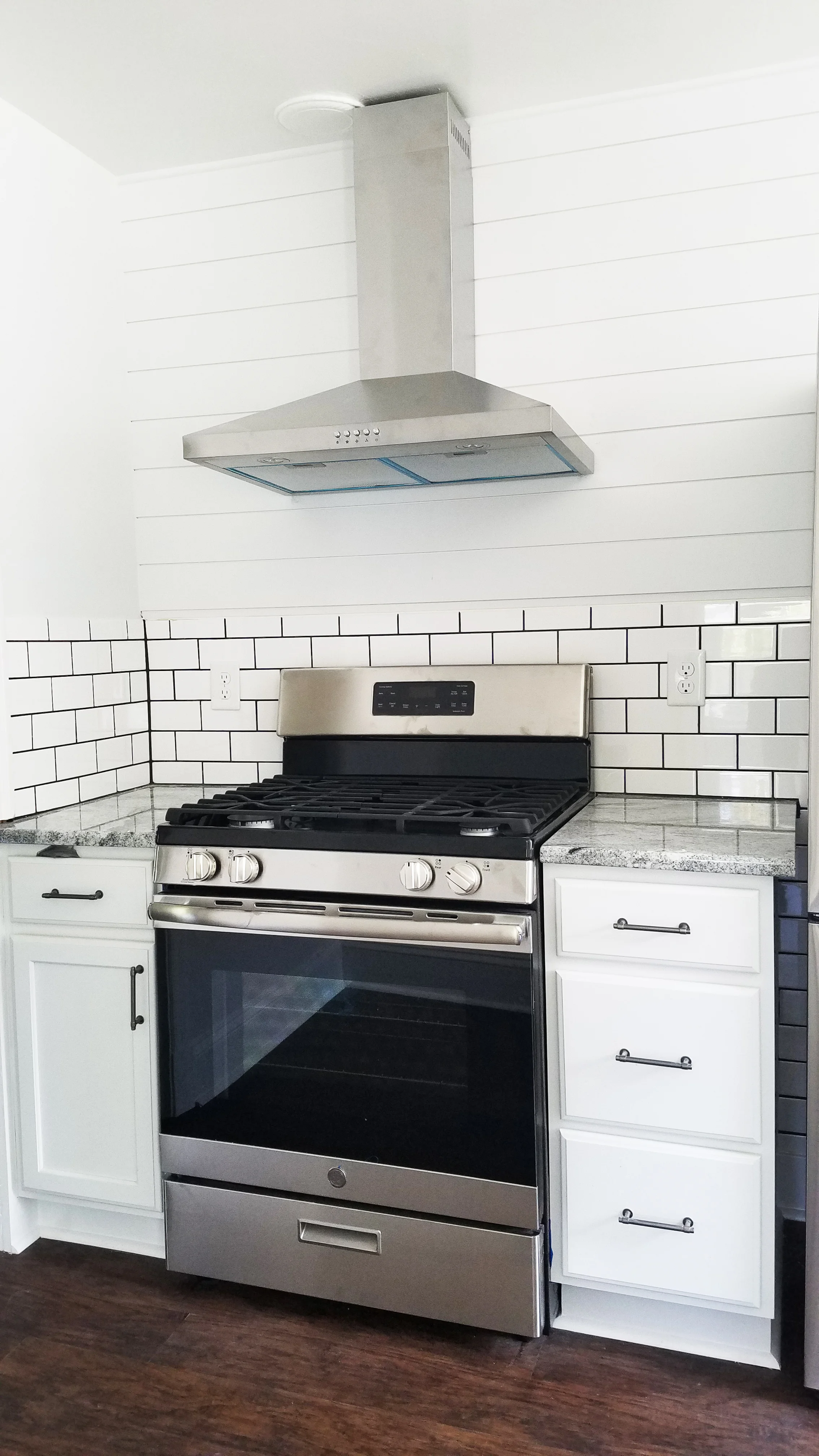
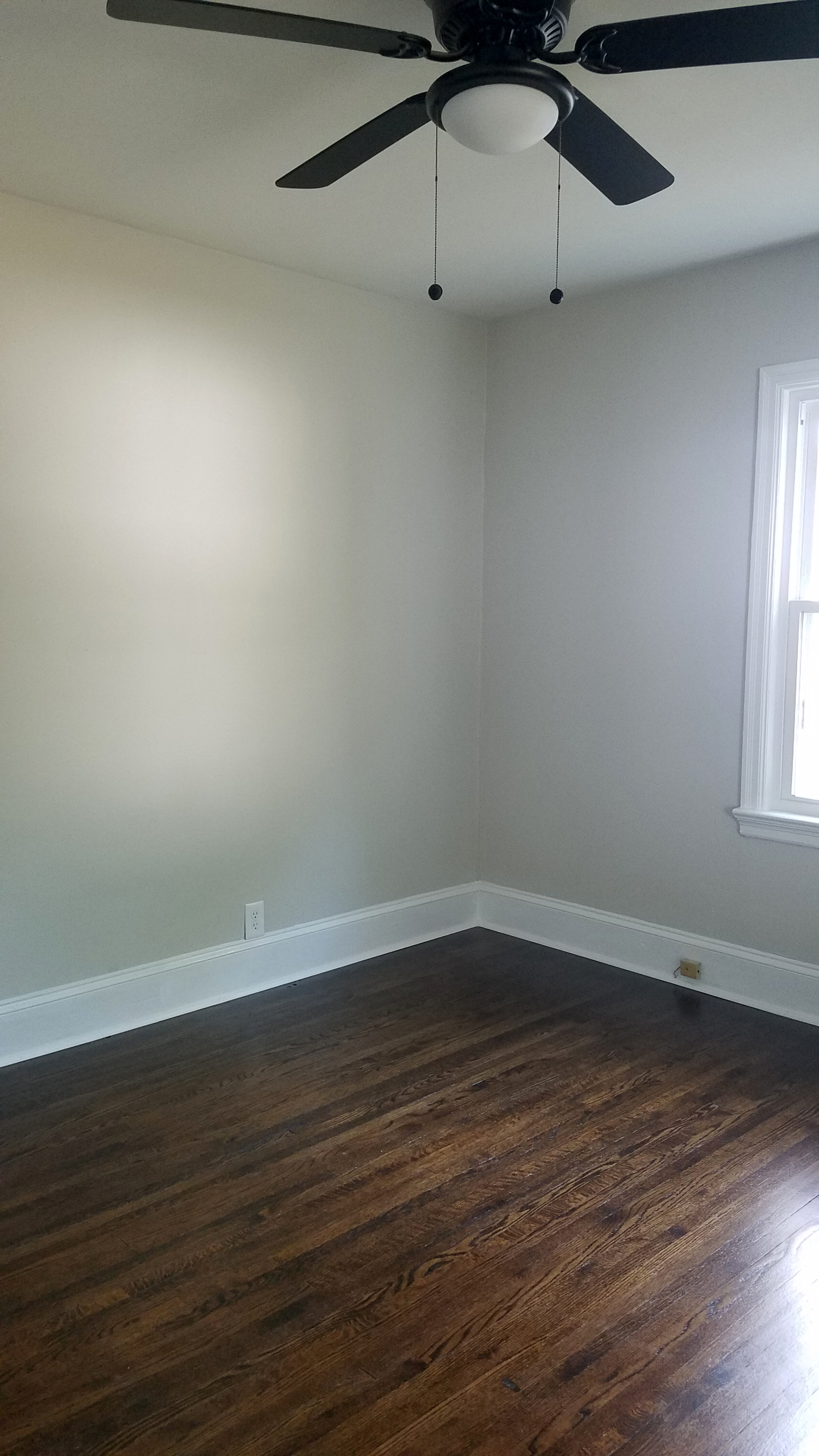
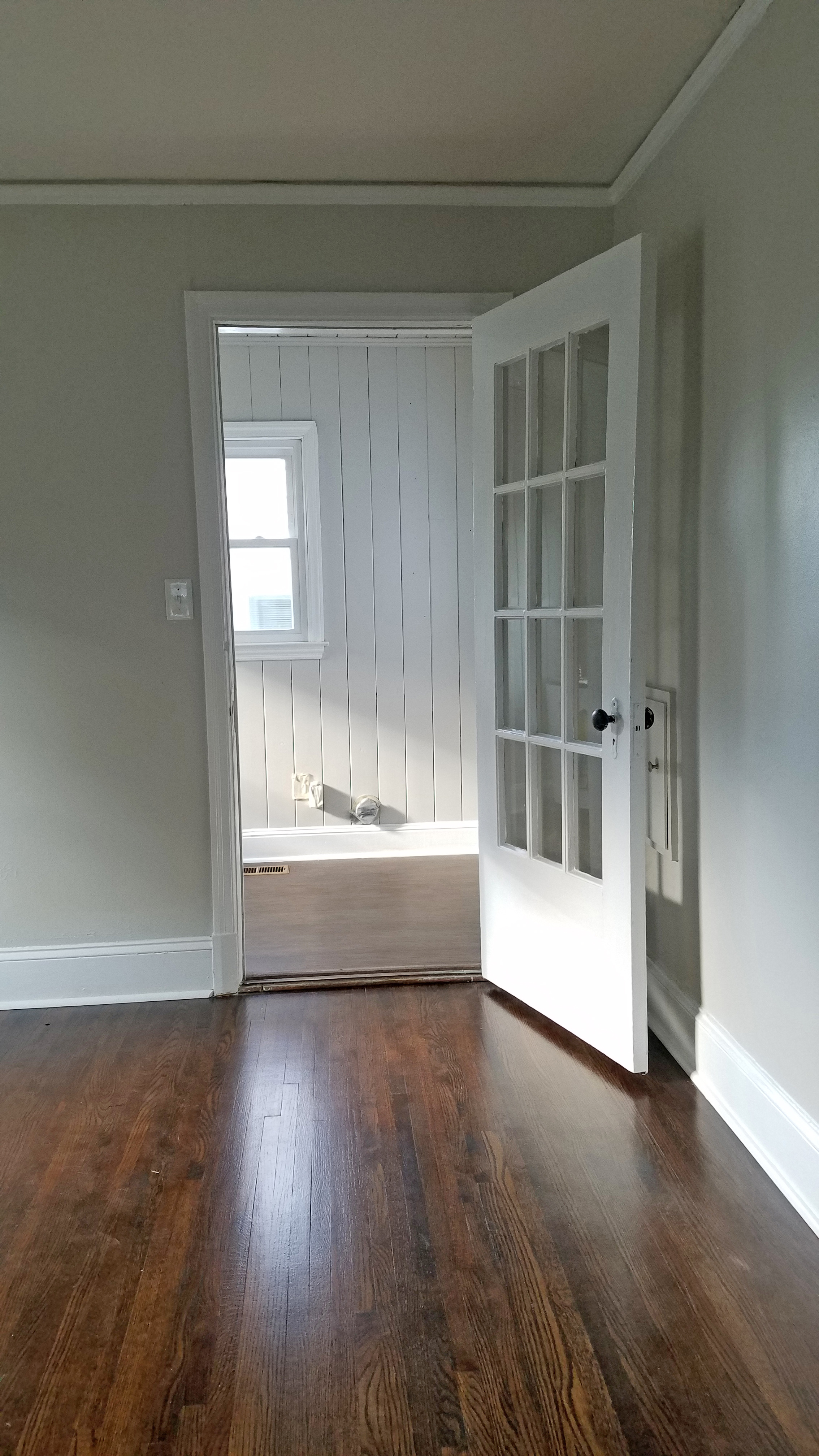
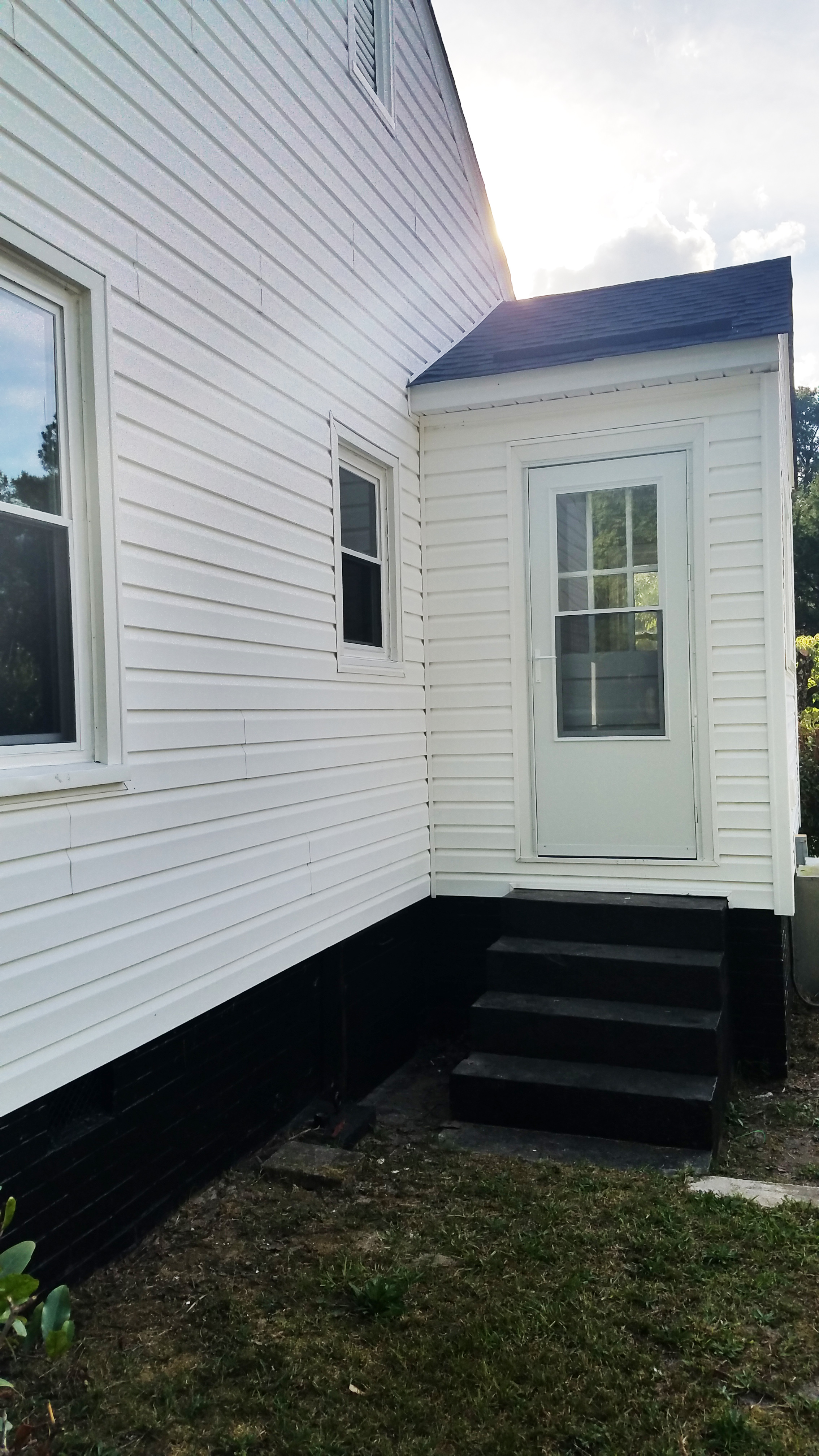
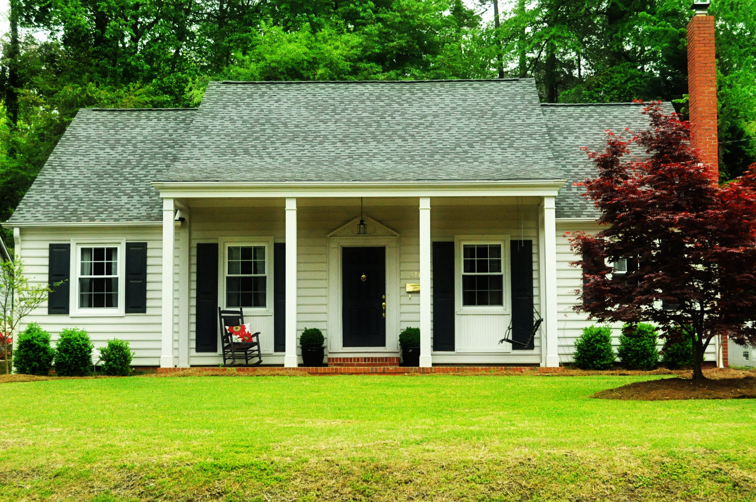
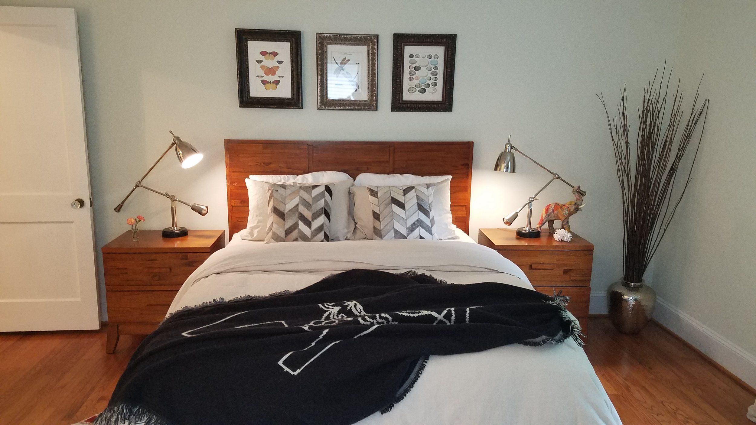
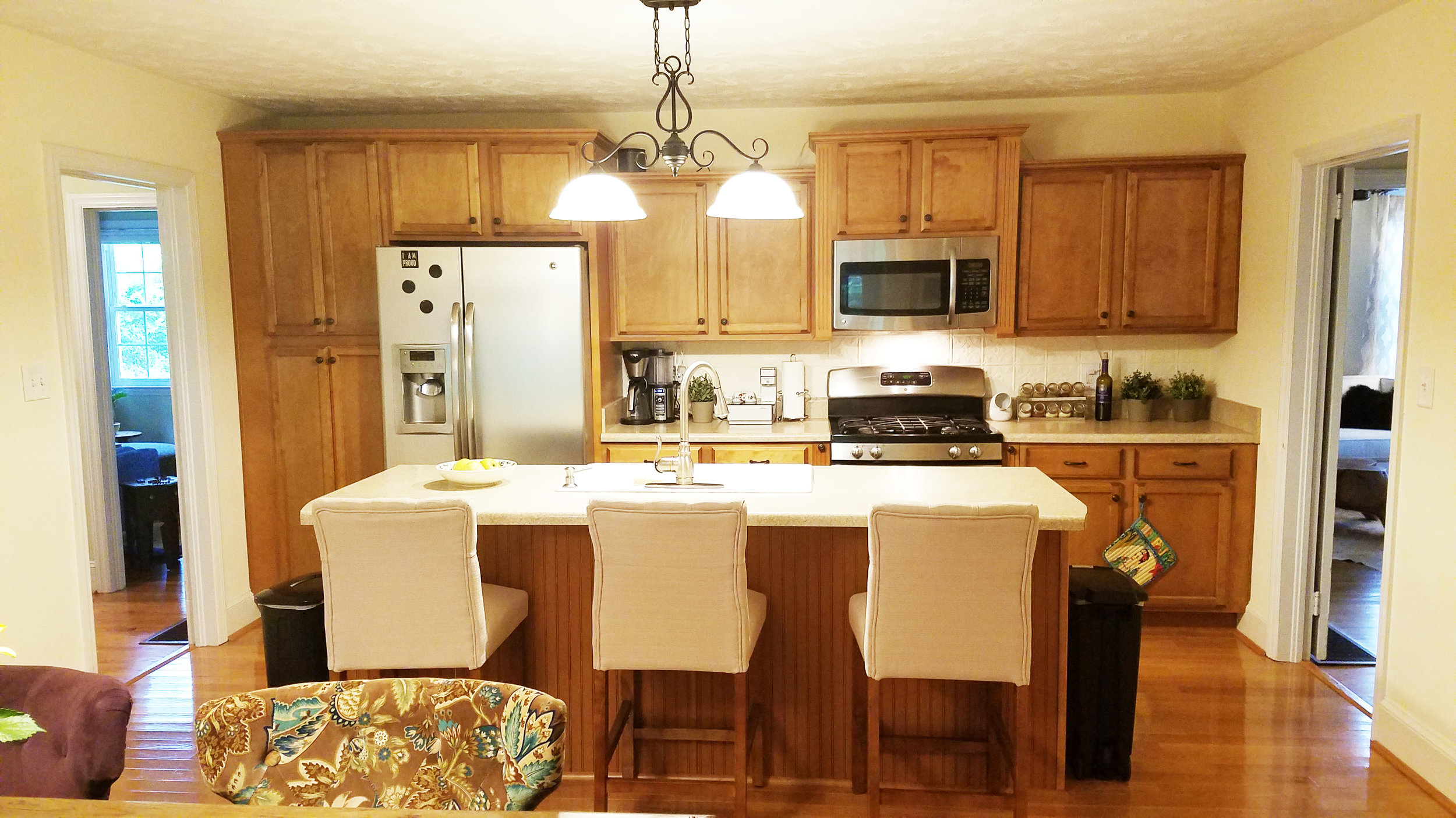
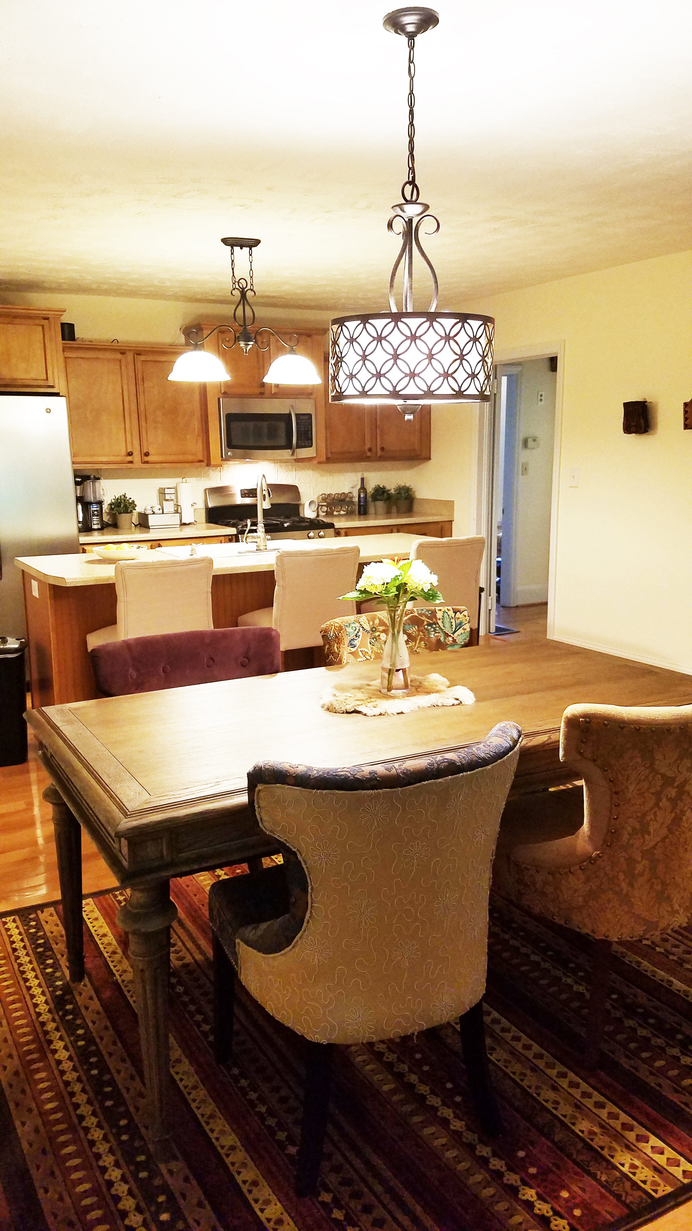
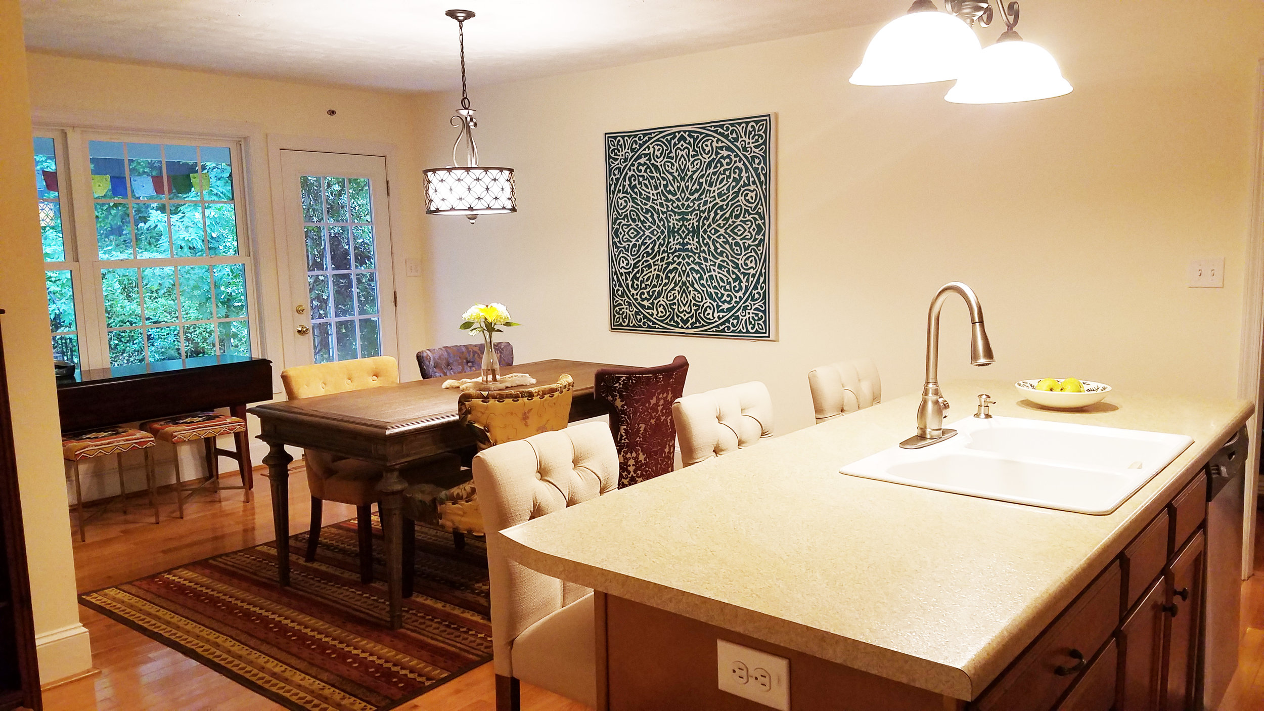
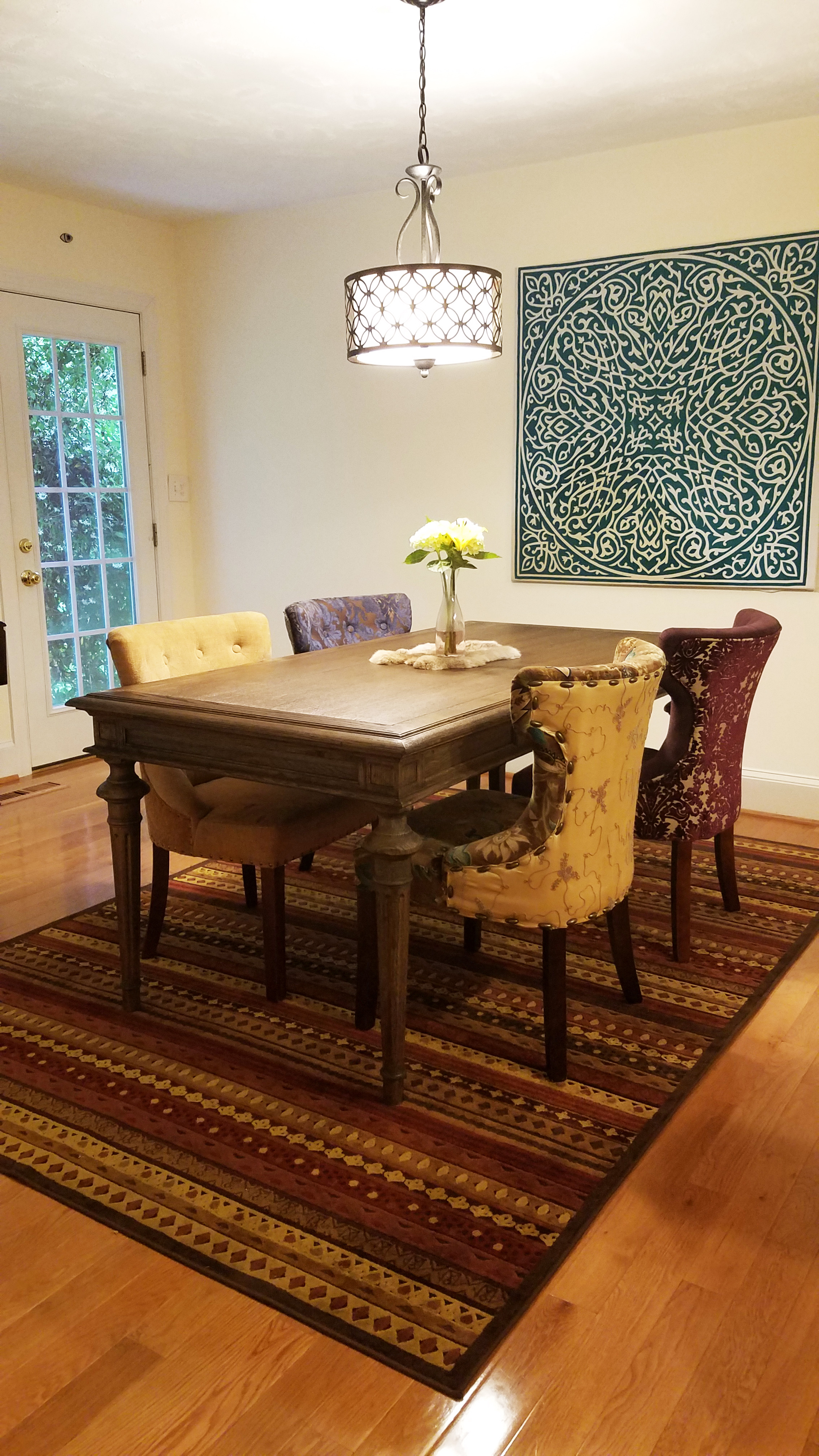
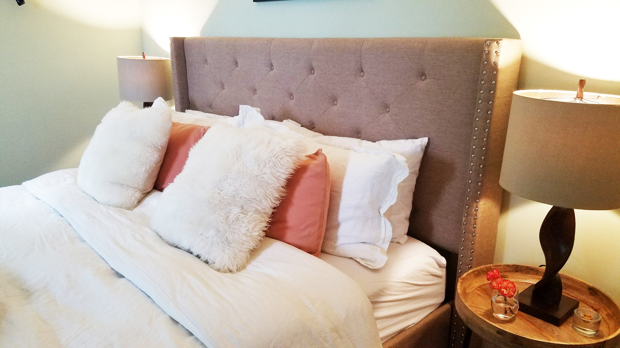
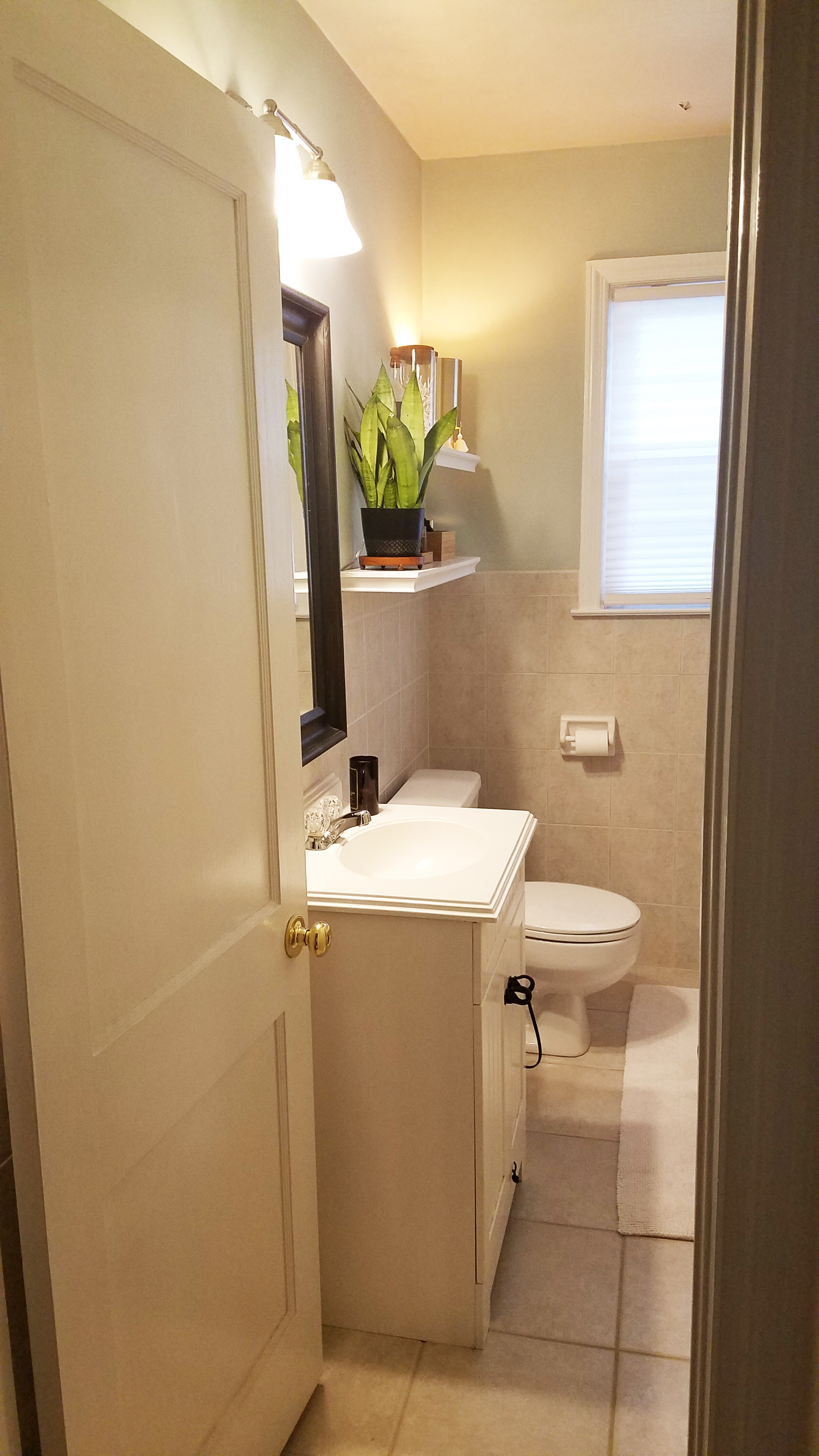
We are delighted to announce the completion (or near completion anyway) of the newest Haymount Home: Glenville Ave. This 1941 beauty features 2 bedrooms and 1 one bathroom and is on a wonderful street in the heart of Haymount.
This project was a shotgun renovation, featuring top to bottom renovations throughout, and it was completed in less than 8 weeks. We discovered this home and realized that it needed to be brought back to its full potential and could not wait to get moving on making it shine!
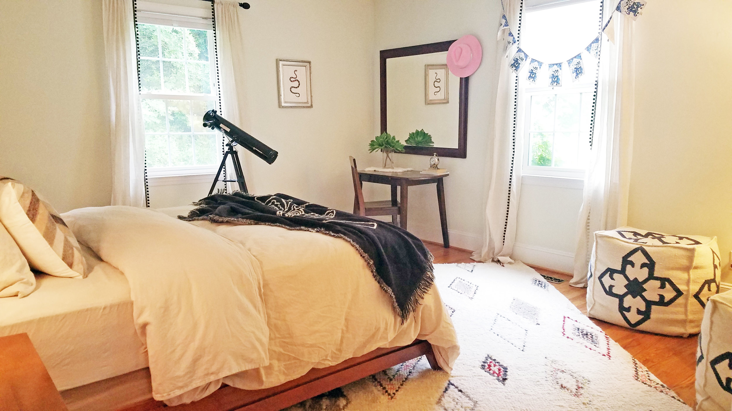
Please enjoy this home tour. Forgive the fact that everything was not perfectly cleaned up (floors still need cleaning and there are a few little things missing like the smoke detectors that are not in and a few missing outlet covers :) They will be finalized this week. There is also a shed that is still under construction and will be renovated as well. Our focus was on the house for now. Don't worry - over the next few weeks we will be featuring a bunch of blog posts with before and after photos for your enjoyment.
Normally we stage all our homes to highlight their beautiful potential, but we were not able to do that for Glenville....because we already have clients moving in! They contacted us prior to finishing the renovations and fell in love with Glenville. We could not turn them away and they promised to decorate it beautifully and let us come back for pictures; we are excited to see how they make it their home!
We welcome your feedback on Glenville. Please drop us a line and let us know your thoughts. What did we get right? What did we miss? Though Glenville was rented before it even hit the market, there is good news in store: we start our next project at the end of the month, so stay tuned!


“House + Love = HOME”
Hope you enjoyed our tour! Drop me a line and let me know what you think! Have a great week!
- Casey and Carl
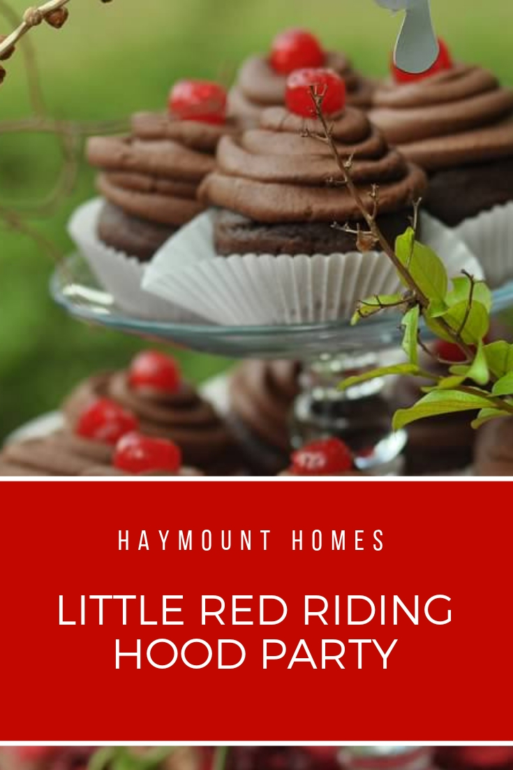
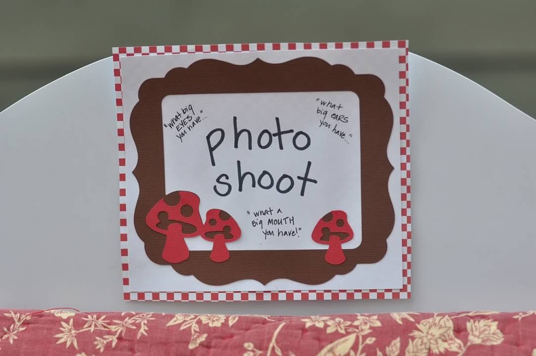
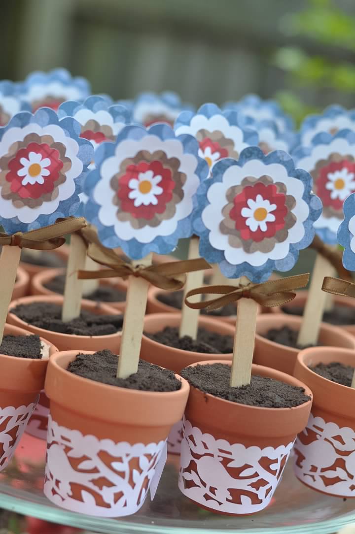
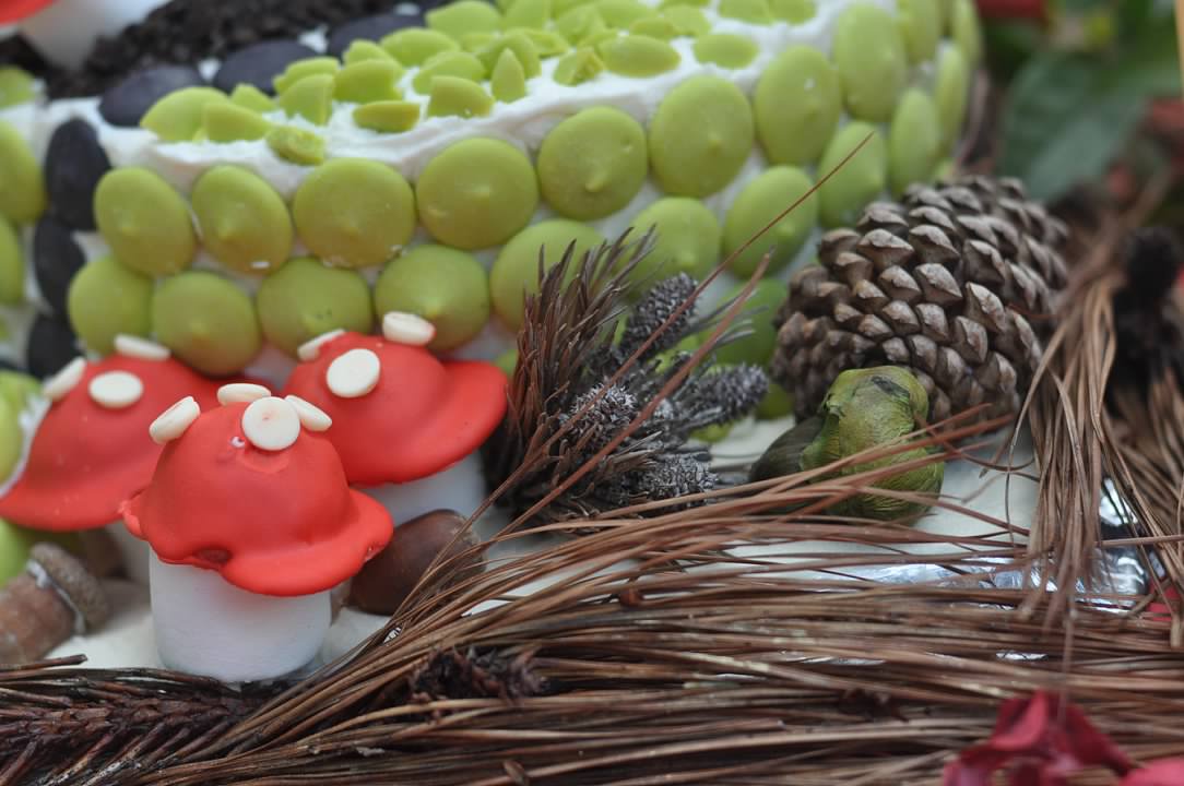
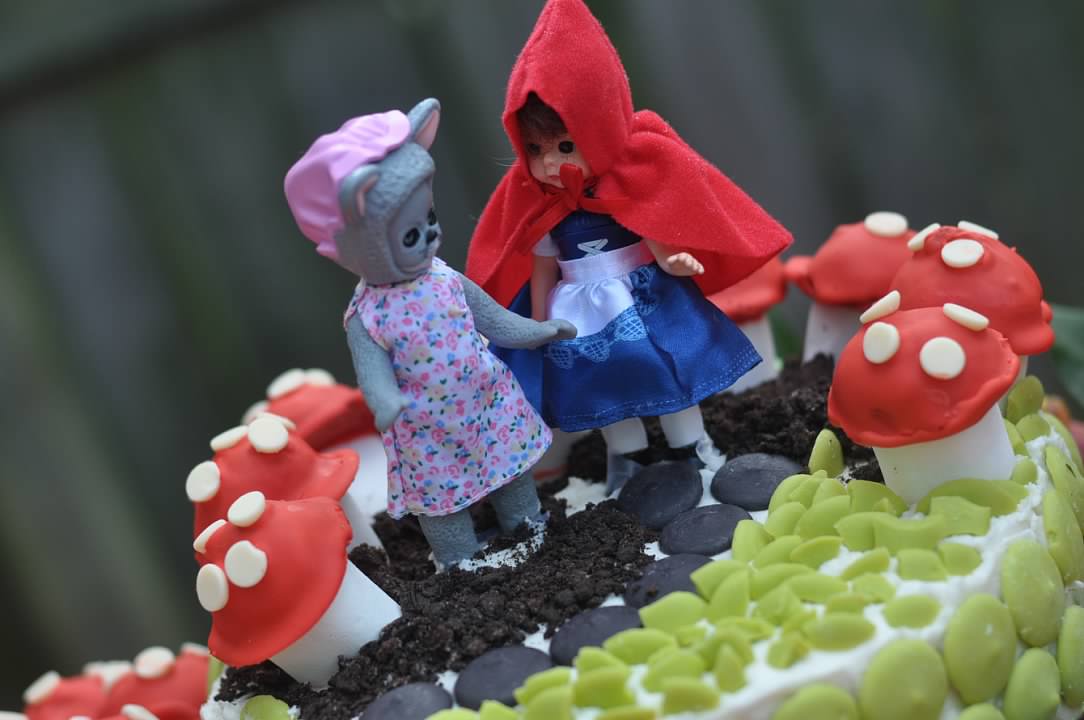
LITTLE RED RIDING HOOD BIRTHDAY PARTY
Ideas galore for your a fabulous woodland party!

Happy Sunday!
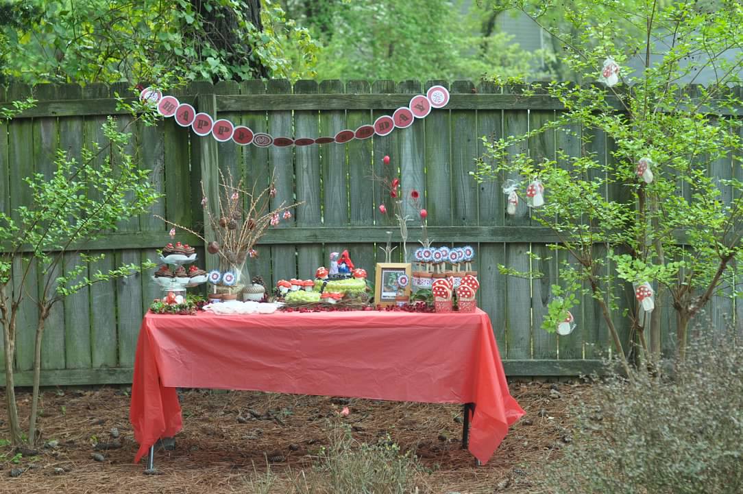
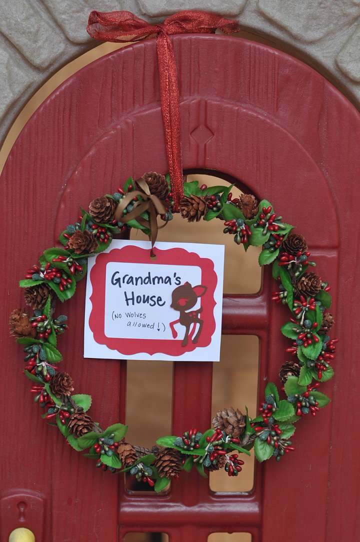
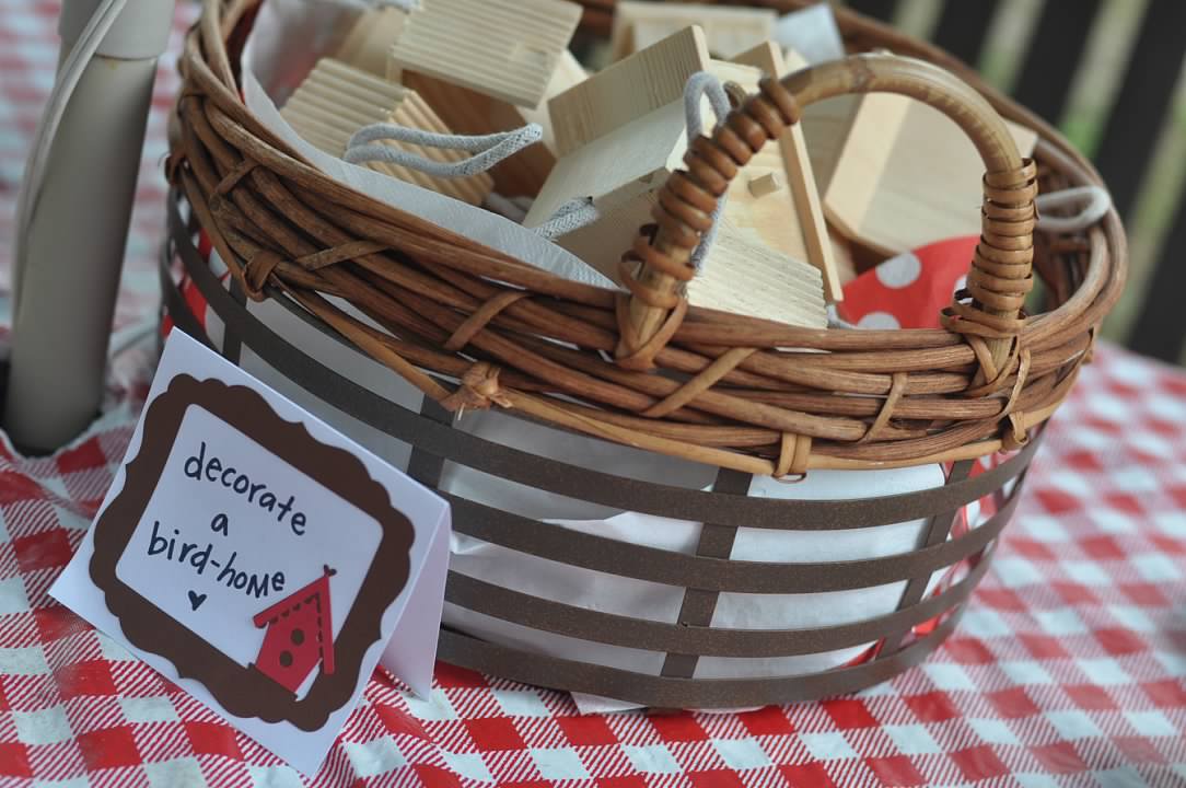
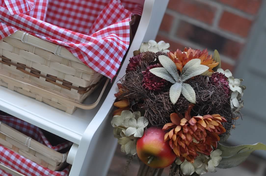
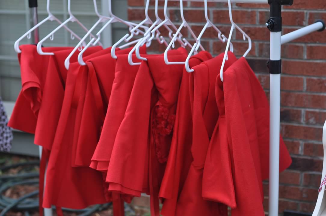
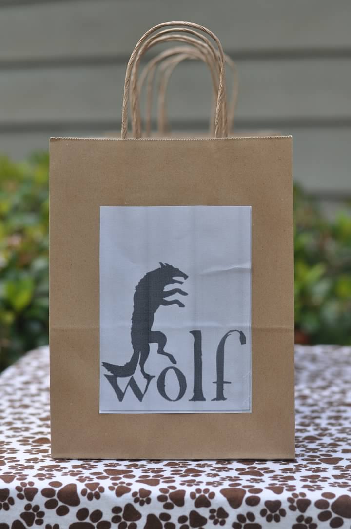
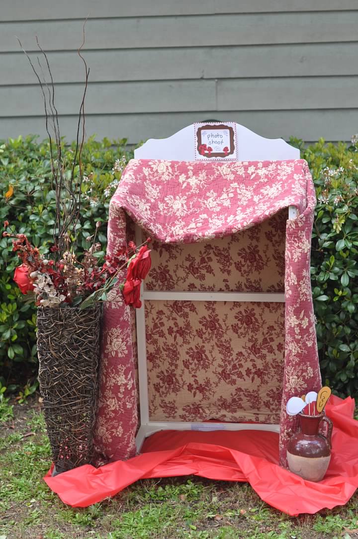
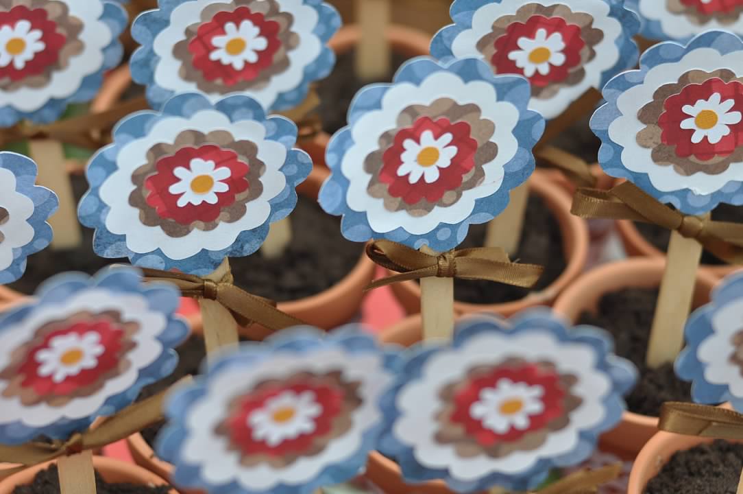
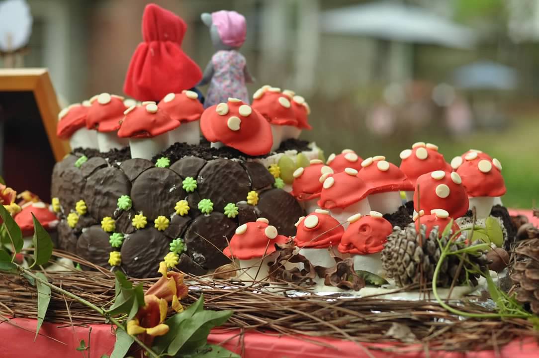
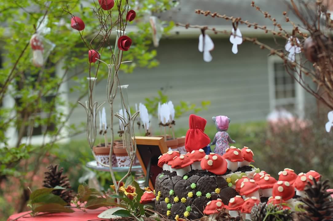
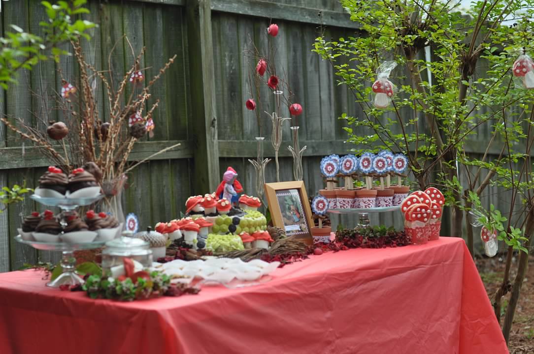
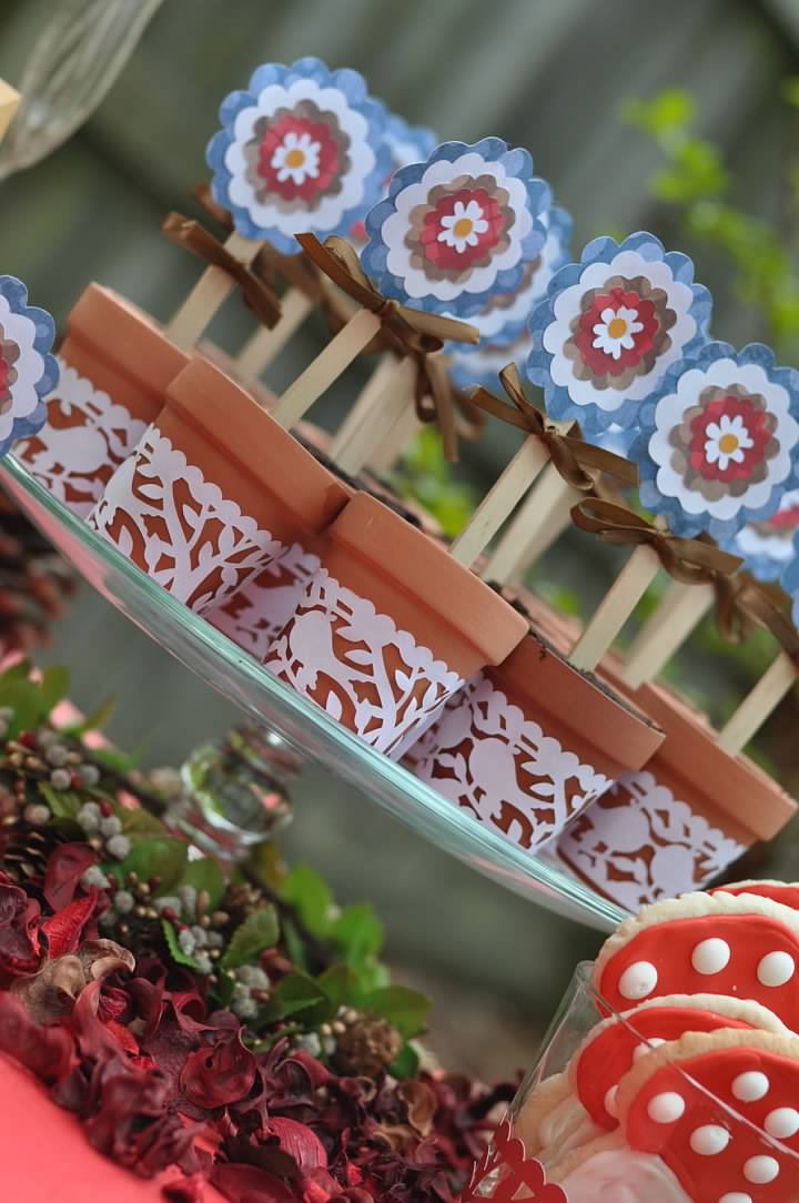
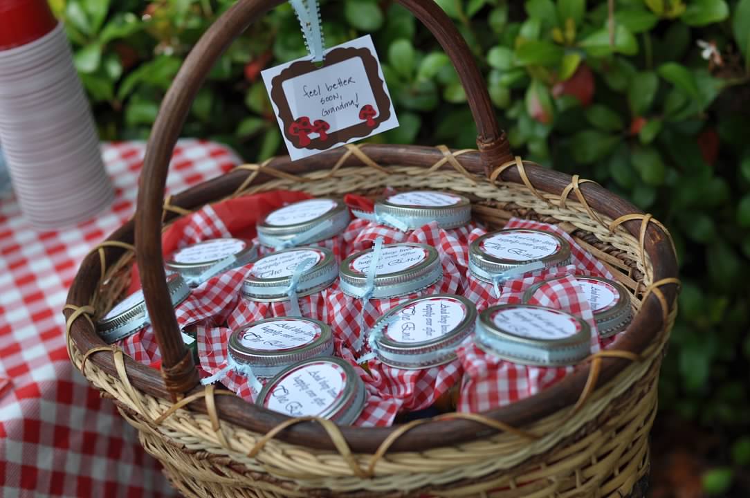
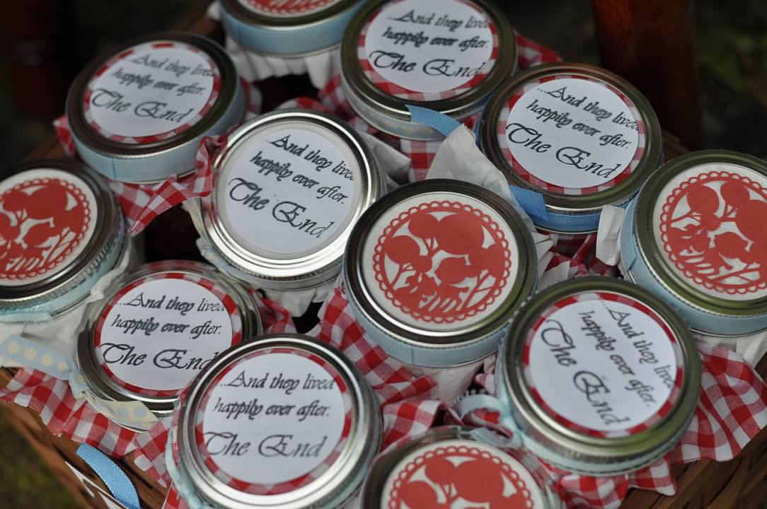
This morning I awoke coming to terms with the end of summer and reflecting on the more "lazy days of summer" (can you tell school and all the schedule chaos has started?). While daydreaming, I was fondly remembering the summer picnic baskets from Elise's 4th Birthday Party. She wanted to have a Little Red Riding Hood party and we loved the idea. Armed with a lot of ideas and fun styles, we created a fun little backyard party for her friends. My amazing Mom sewed costumes for the kids and they got to play games of chase, trying to get to Grandmother's house without losing the contents of their basket....or being caught by a wolf!
I remember it rained up until an hour before the party that day. It was a mad dash to get everything up and ready, but it added to the race theme! The food was so fun and the kids had a great time. Enjoy this fun photo montage of the day and hopefully you can get some ideas for your next party. I did not spend time editing the photos, so please ignore the imperfections and focus on the fun.


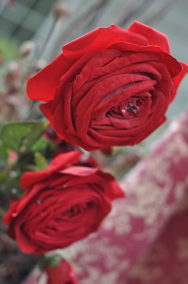


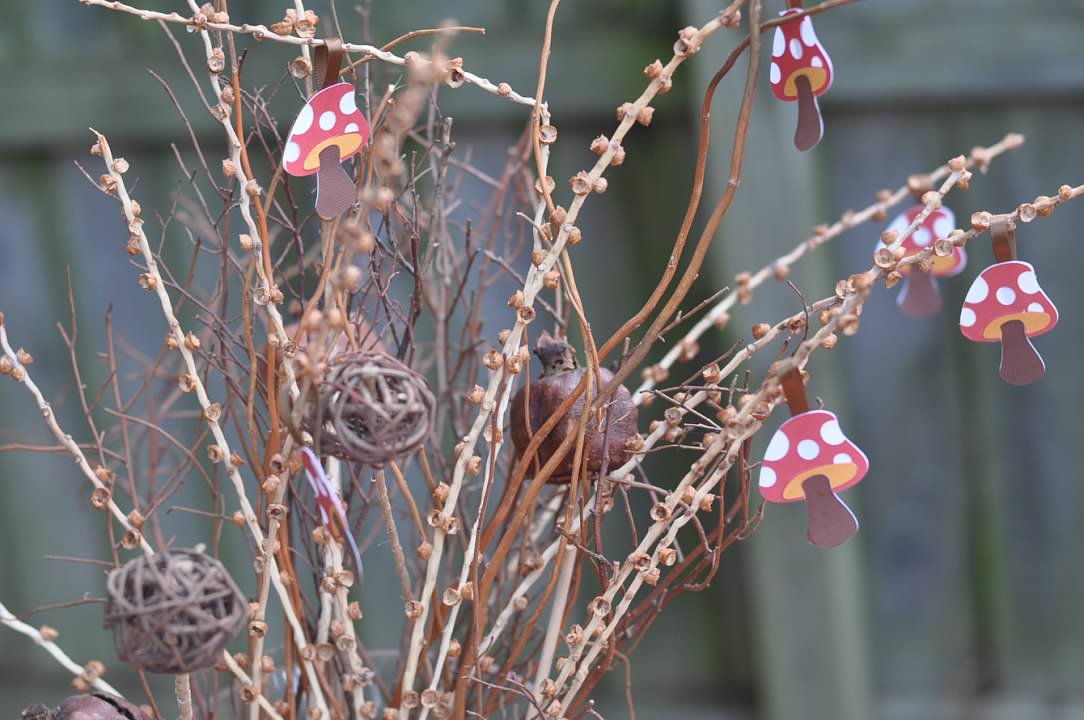


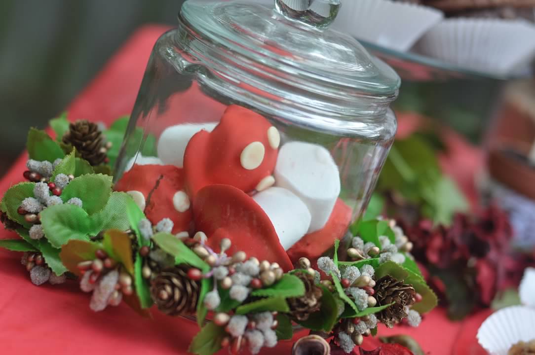

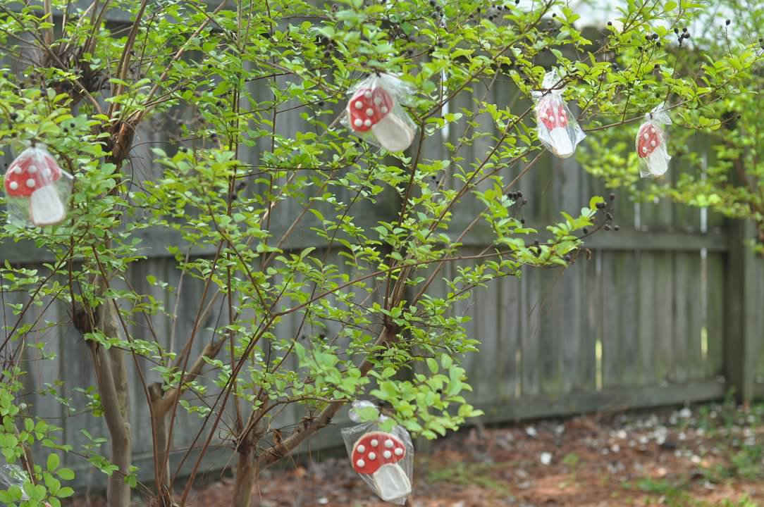

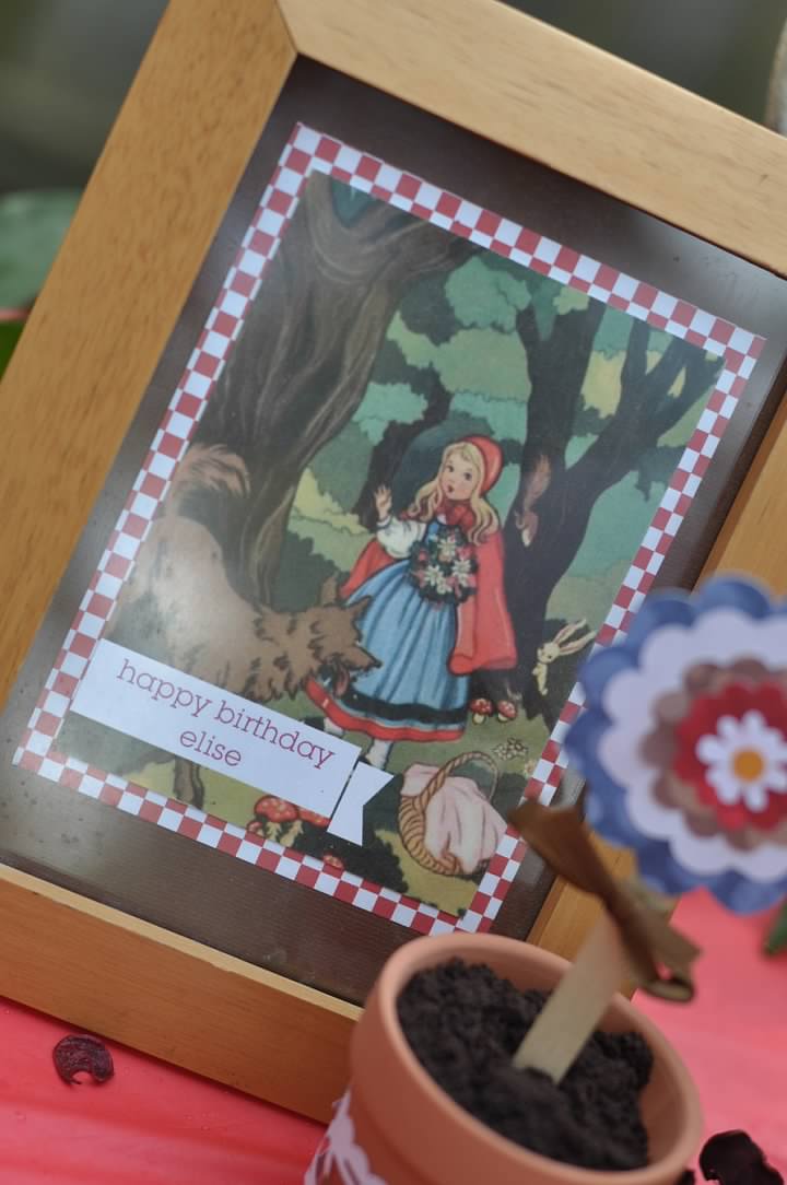
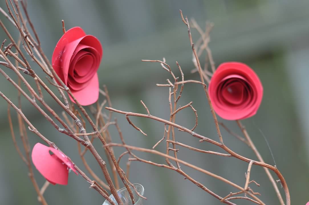


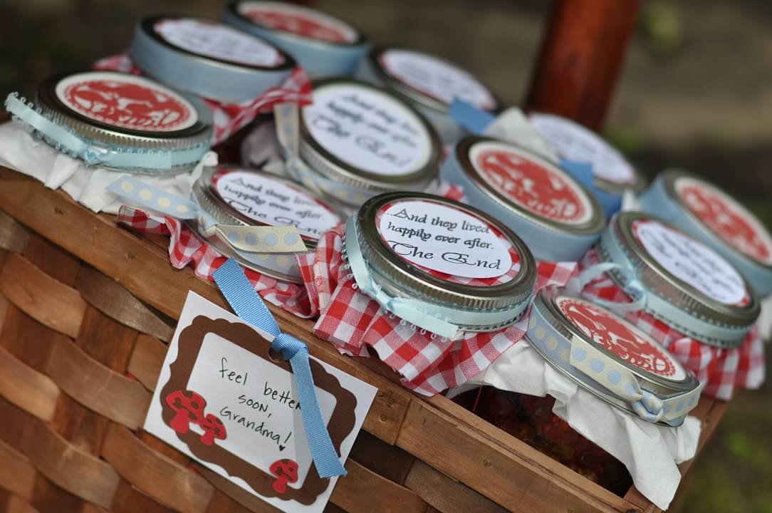


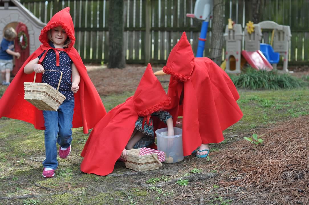


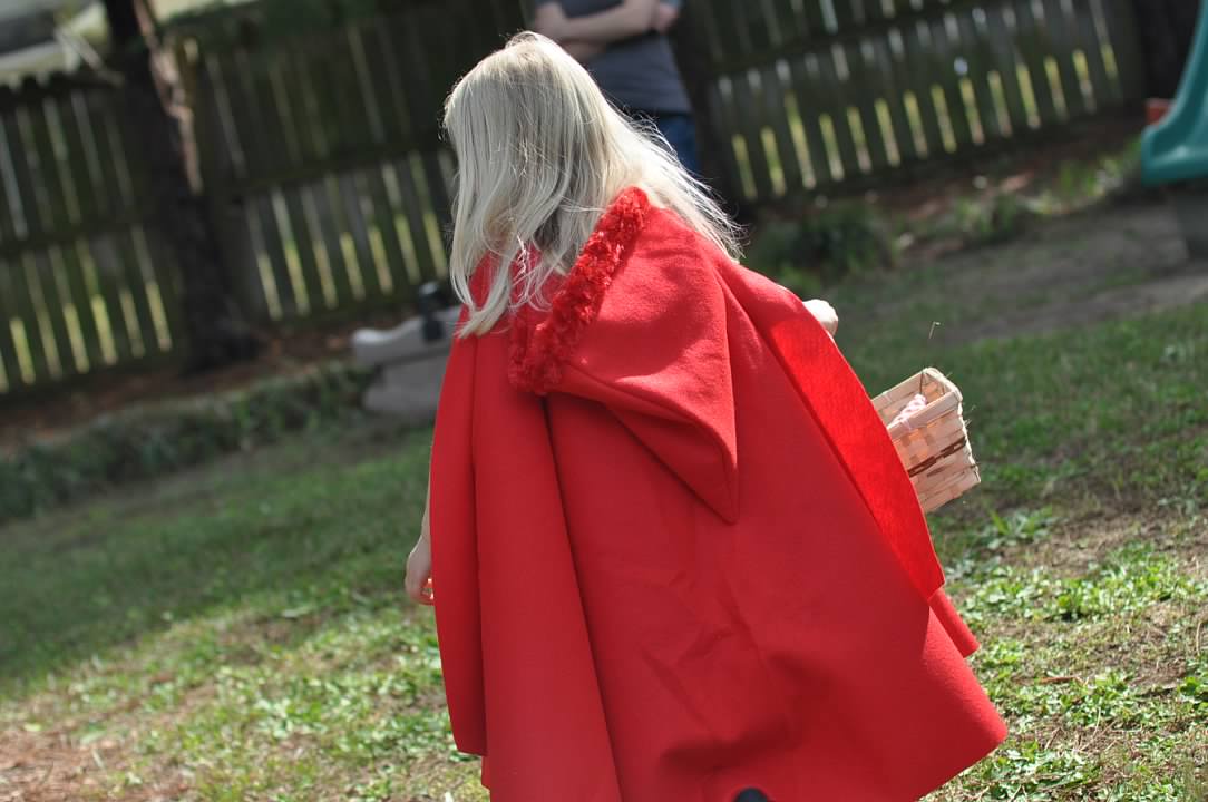
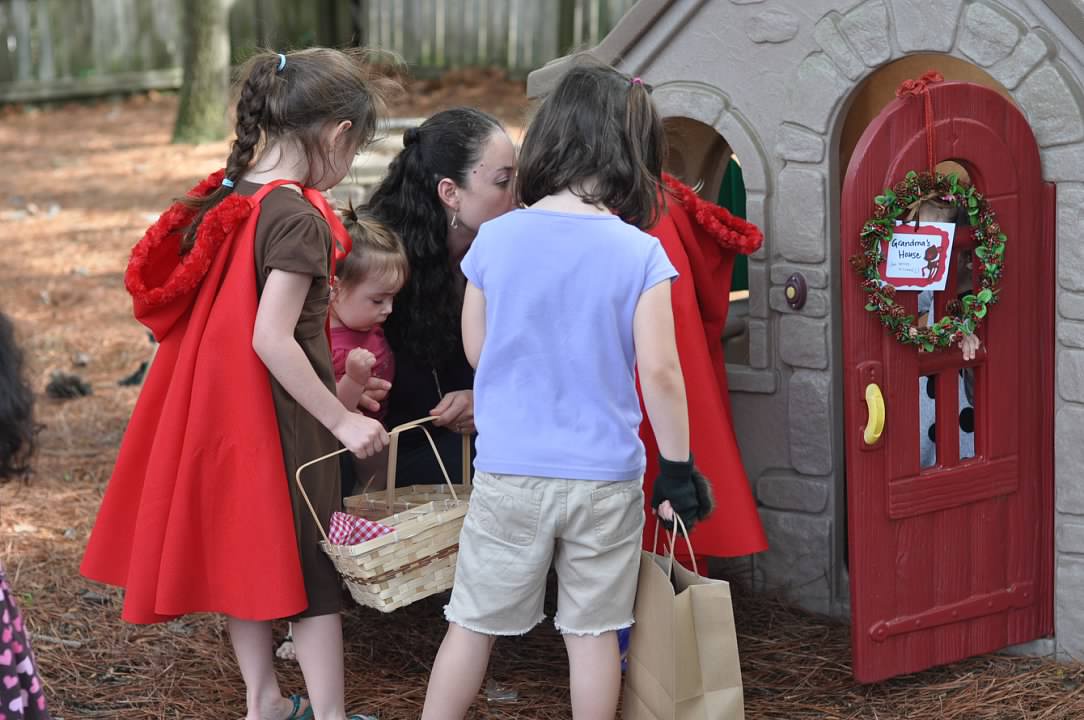
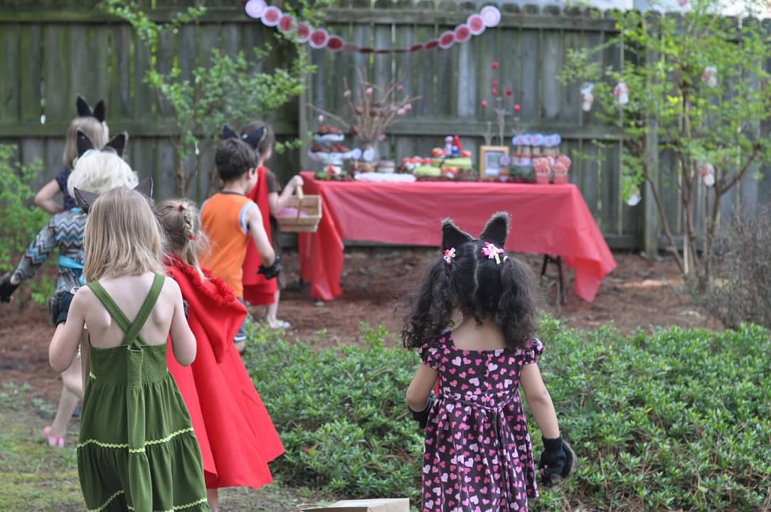
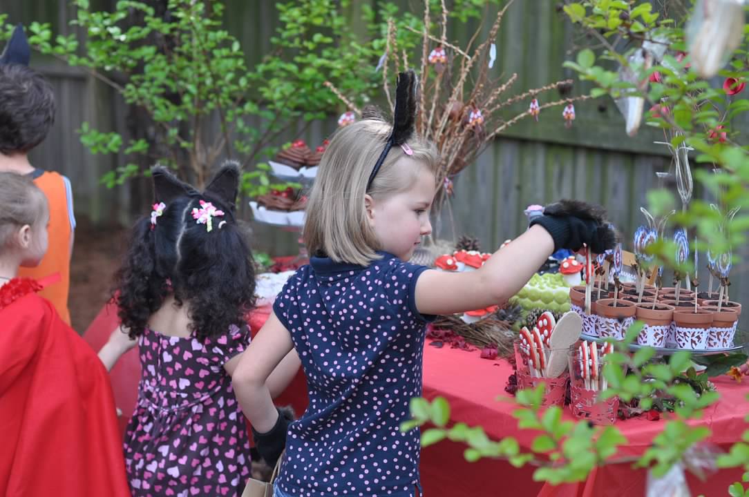


“Into the woods she went, basket in hand and wearing a little red riding hood.”
Hope you enjoyed the photos; have a great Sunday!
- Casey

WESTMONT DRIVE GETS A MAKEOVER


Happy Memorial Day! I hope you and your family have had the opportunity for some fun family time this weekend. We jumped in the car yesterday and went to Wilmington to watch Terry Sanford (our local high school) compete for a spot in the state championship for baseball. While we were there, we hit Wrightsville Beach for some sun and waves. Of course, the kids had a blast and so did Carl and I.
It has been fun showing off the Westmont house to new clients. One of the reasons I have enjoyed it so much is that our current clients have decorating taste that is fresh, modern and really fun. They have been all over the world and have collected many treasures along their path. Most people that see the home ask me if they can rent it with everything inside of it! Not only do we appreciate them taking care of our home, but we love how much everyone else is enjoying it.
I just had to update the site with some new photos of their work. Although both of them are highly successful in their current positions, I am pretty confident that they could switch to interior design and have a stack of clients waiting. It's fun o see the same space take on a completely different vibe.
Without further ado, I give you the Westmont Home transformation! Enjoy this fun photo montage of fun design!


I hope you enjoyed your house tour! I know I enjoy every minute in this beautiful space! This home is still available for leasing this July and it is also for sale. Schedule a viewing today!
- Casey

HOT CHOCOLATE BAR
Every January needs something fun and a hot chocolate bar might just be the solution

BURRRRR. January is cold. Christmas is over. Snow has closed school (again). Kids are stir crazy. Parents are starting to question their sanity. Am I alone? I hope not.
When it is cold outside, I am cold inside AND out. Since moving to the South, I will admit that I have become a bit of a cold weather wuss. I spent the first 24 years of my life in Wisconsin and you'd think I would have thick skin. However, as I explain to most people, I was cold there too.
When I found myself in North Carolina, I had trouble tolerating the heat. Although I had always lived in the cold and did not love being cold, I was not used to the opposite effect of equivalently intense heat. I had to exchange my closet of sweaters, scarves and coats for a lighter wardrobe of tanks, dresses, and shorts. Although I can appreciate any good excuse to shop, I felt a little (LITTLE) sad to be leaving the cold weather behind.
However, the longer I have lived in the South, the less hot it seems and I almost find myself craving some intense heat; I guess that's acclimation for you. With that in mind, when it gets cold here, it feels even MORE cold since I am now used to being hot. I know my family back home is laughing at me and my 15 degree cold when they consider that a warm day in January, but we have already identified that I am now an official cold weather wuss.
So what's a girl to do? When I am cold inside and out, that means it's time to warm up. For most of us parents, a good cup of coffee or tea will do the trick. However, when it comes time to warm up the whole family, nothing beats a cup of hot cocoa.

A few years ago, we implemented a January tradition in our house: The Hot Chocolate Bar. It is exactly what you think it is: A bar completely devoted to the production and consumption of hot cocoa (and additional delicious treats that go with it!). Following Christmas and all the festivities of three months of holidays, January can leave us feeling somewhat flat. I think it is mostly due to the energy and excitement, visitors, and events of all the holiday season that precedes it. While I am usually ready for life to slow back down a bit, I always feel that a little January "pick me up" is in order.

Thus, the Hot Chocoate Bar tradition was born and continues to be something to look forward to as we celebrate winter. You can make a bar as simple or complex as you want. We often rotate what goes on the bar, but the basics stay the same. To craft your own bar, you'll want the following:
- Cocoa Powder
- Dry Milk (or you can skip this and warm up milk for the bar as needed)
- Powdered Sugar
- Vanilla
- Marshmallows (we like all sizes!)
- Cinnamon Sticks
- Peppermint Sticks
- Treats
- Mugs

We always include little cookies or candies that go with the bar so that it is even more festive and fun. When we are ready, we warm up the water or milk, and everyone can create the cocoa to their liking. If you wanted things to be easier, you could just supply pre-made mix as well. You can buy that or you can use this recipe: 2 cups sifted powdered sugar, 2 cups dried milk, and 1 cup unsweetened cocoa powder. Kids add a dash of vanilla to their cocoa and often add a peppermint or cinnamon stick (we had already eaten our King Leo sticks before I could photograph them...off to order more!) When we really get after it, we make our own marshmallows (most because it is super fun and they are really yummy!)
I don't know if you are like me, but I use Amazon for easy ordering, and this cocoa bar is no exception. We keep ourselves well stocked with goodies and ingredients for the bar. Quality matters here since there are so few ingredients, so I recommend using higher quality ingredients such as:


“Hot Chocolate is a HUG from the inside”
I hope you can carve out a spot in your home to include a hot chocolate bar. We have found it to be a fun way to start the year and a cozy way to warm up. With the amount of snow days we've have this year, we'll be blowing throw our hot chocolate bar at twice the speed. Oh well. Most of the time, hot chocolate is even better on a snow day.
Do have a January tradition? Have you had a hot chocolate bar or station in your house? Was it fun? What did you serve? I'd love to know!
- Casey
Please note, this post contains affiliate links for products that our family uses for our hot chocolate bar.
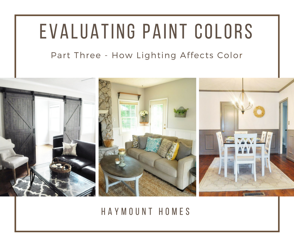
CHOOSING PAINT COLORS - PART THREE - EVALUATING THE LIGHTING
Understand how lighting affects paint colors so you don't end up suprised

Welcome back to my evaluation of paint color series. The purpose of this series is to help evaluate paint colors BEFORE they hit the wall. We have all been on the opposite side of that scenario. We have chosen a color that we just "knew" was perfect for our space, only to waste $100 in paint and 15 hours of our time painting the room that color and end up being disappointed. Whether the shade was not quite right, or the color ended up totally different once it hit the wall, it is never fun to waste your time and money on projects that leave you discouraged.
Learning how to properly evaluate your colors can help you avoid this scenario. I cannot promise that the above story will never happen to you again, but hopefully you'll see a decrease in your painting regrets!

In the first part, we learned to evaluate the undertone of a paint. When you do this, you can better understand the type of shade that will pull through when the paint hits the wall. If you missed that post, you can catch up here.

In the second lesson, we covered evaluating your layout when choosing paint colors. Realizing that rooms are viewed together and often in the same visual lens helps you choose colors that coordinate and lend themselves to a pleasing "whole house" palate. To catch up on that lesson, simply click here.
Now in the third part of the series, we are going to cover how lighting affects color. Once you have determined your undertones and looked at your layout, you need to understand lighting and what it does to color. The most important aspect of lighting is determining what direction your home and rooms are facing. What I mean by that is knowing the position of your home on your land/lot, and then from there establishing where north, south, east, and west are. Once you know the directional position, you can determine what direction each room is situated within your home.

The purpose of determining the position of each room is that lighting is directly related to room position. The conditions of lighting in a north facing room, are quite different than the lighting that is received by a south facing room. The same goes for an east or west facing room. Therefore, colors that are painted in a north facing room might look entirely different when it is painted in south facing room. This is one reason that you can decide to paint a room "gray" and it ends up looking "blue". You can paint a room "white", and it ends up looking
"yellow". When the undertone combines with the natural light, it can enhance certain parts of the paint and bring through those undertones more strongly than you had anticipated.
COLOR ANATOMY
One more note on this before we get started. It is helpful to understand how we actually "see" color. Your eyes and your brain work as a team to actually create the colors you see. You have light receptors within your eyes that actually "grab" wavelengths and then transmit them to your brain. Objects (walls, furniture, anything!) actually all absorb or reflect these wavelengths. When an object reflects all wavelengths, then the color is white. When an object absorbs all wavelengths, then the object is black. When an object does a combination of absorption and refraction, we see color. We only see what is refracted, not what is absorbed.
Thus, no object or wall actually has color. Rather, it only has refracted light that is thrown back out and not absorbed. We only see the color thrown back (refracted wavelength of color), and then our brain processes that color to identify it. When you look at a basketball, you see orange because orange is refracted and the other colors are absorbed. You have to have light to have this refraction occur. Entering a dark room is a perfect example of this. When you enter a room without light, the room appears dark. Even though there are some brightly colored or light things in the room, they are not seen as light because there is minimal light being refracted. If the sun comes up or the lights are turned on, now our eyes receive the refracted wavelengths and our brains can process them as color.
Therefore, it is necessary for light to "bounce" in a room and refract the wavelengths of that color within the room for us to see the color that is there. When you are deciding to paint a wall, it is important to consider how much light is going to be there. Paler colors have less absorbed color and are more dependent on refraction for their purest form. Additionally, because the color is still subject to our brain processing the information, one person might see a certain shade of a color and someone else might have a slightly different opinion of the same color. Neither person is wrong, but they truly might be seeing different levels of refraction and processing them differently.
Have I confused you yet? It doesn't need to be that hard, but you need to understand how light and color work so you can utilize that in your paint selection. Hang in there.
One more thing. When we discuss lighting from this point forward, we are discussing the natural light that a room receives from the sun. Obviously, you can add artificial lighting to spaces, but that will change the tone of the room depending on the shade of lighting you choose. You need to start with the room's basic position and natural light and then move from there with paint color selection. Artificial lighting can be added later to further enhance the room's tone and feel (I will add a note to this at the end).
Let's unpack this a little bit and start with some basic ground rules for each type of room.
NORTH FACING ROOMS
North facing rooms tend to be darker, receive less natural light, and therefore tend to not "throw" the light around the room as much. This lack of light naturally means that the room will bring out cooler, less warm undertones because there is less refraction of light.
If you have a darker color in mind, they tend to do pretty well in a north facing room because the paint itself provides a lot of tone and it doesn't require as much light to "find" the color. These rooms tend to be cozy by nature and play well to enhancing that feeling with darker colors.
If you really want to paint a north facing room a lighter color (which I have been brave enough to do), then you want to remember that cooler rooms are going to bring out cooler undertones. That means if you choose a white color with a gray undertone, it is going to look much more gray and cool than it will white. If you choose a white color with a yellow or pink undertone, it will bring more warmth to the space and the color will bounce a bit more.
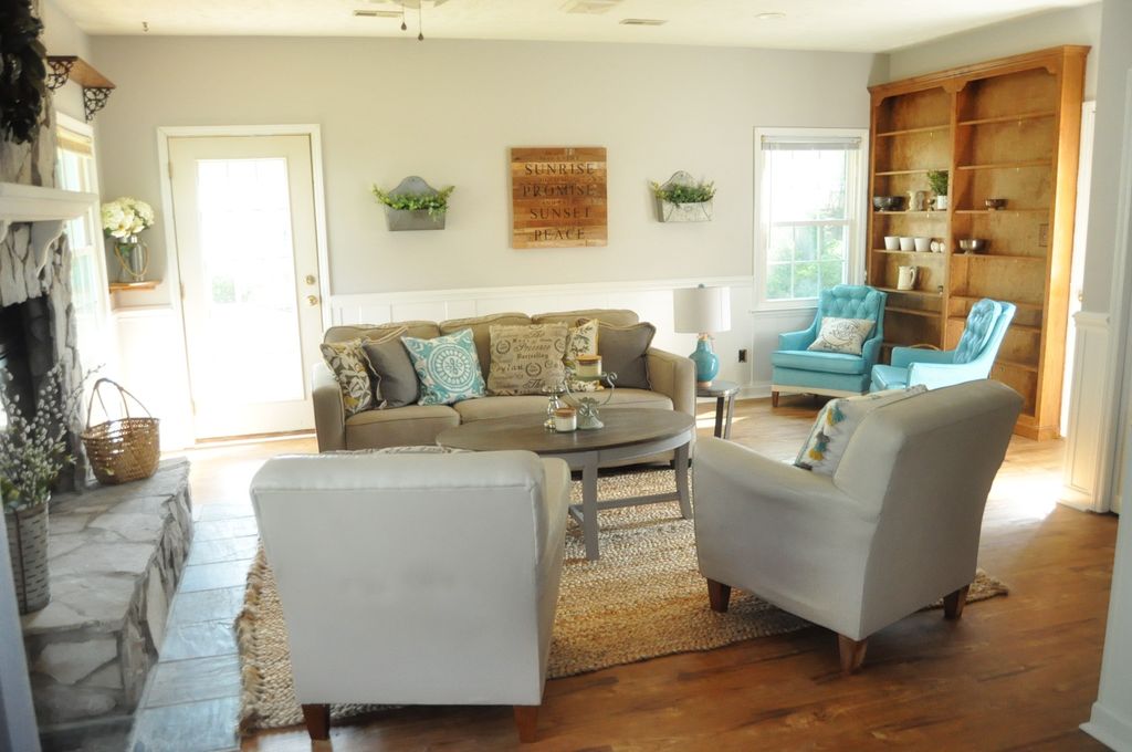
The room above is a north facing room and is shown painted with in Farrow and Ball's Cornforth White. This color is a favorite or mine because it is neither too warm or too cool. In a room with either warm or cool lighting, this color will still shine beautifully. It is still a light color, but has enough color pigment to pull through and refract even in a darker room.
SOUTH FACING ROOMS

South facing rooms are the darlings of decorators. They receive light throughout most of the day and have plenty of sun to bounce around the room. That means you can get away with nearly any shade in a south facing room, although if you want to paint something a lighter color, this is the room to maximize that effect.
A south facing room will still bring out undertones, so be sure to consider that with your choice. A yellow or pink undertone will read creamy and warm in a sun filled south facing room. For example, one of the decorating world's most popular white colors is Benjamin Moore's White Dove. My daughter recently painted her room this lovely, creamy white color. It reads slightly yellow due to the bright southern light that the room receives. If you select a white that has a cooler undertone, the white can read more contemporary in the space. Depending on your goal, you can select things to warm things up or cool things down.
If you have a south facing room, enjoy it. It will be a home run with a pale color and it will still live up to a dark color too. In the south facing room shown above, the color is Farrow and Ball's Skimming Stone. It has warmer grey undertones and the light just dances around in the room, making it bright and cozy.
EAST FACING ROOMS

The sun rises in the east and sets in the west. Therefore, east facing rooms will experience more sun in the morning and less sun as the day progresses. Therefore, consider the function of the room and what time of day the room will be utilized the most to help you determine what color you want to see at that time. If you are looking to retreat to the room toward the end of the day, then plan for the darker lighting that will be there at that time. If the room is a bedroom and you want to greet the day in a lighter environment, then look to capitalize on the early sun and go with a lighter color that will be brighter in the morning.
As as undertones run, east facing rooms are often felt to provide a cooler undertone, so choosing colors that have cooler undertones will likely enhance the color of the room. For example, if you paint an east facing room with a yellow undertone beige, it is likely to turn out a bit different than it looks on the paint chip. If you chose a similar beige with a green undertone, which is a cooler color, then you will likely see a color that shines truer when it hits the wall. That is not to say you cannot choose a warm undertone for the color in an east facing room, but understand that it will likely have more shift on the wall from what you might expect.
As mentioned, the time of day will matter too. In the morning, east facing rooms will have more warmth due to sunlight, and they will fade to cooler as the day progresses. Keep this in mind when choosing color samples.
The office room shown above is an east facing room. It is painted in Farrow and Ball's Strong White. This color is a cooler gray white, which was just beautiful in this room. In the morning, the walls look nearly white with a cool gray undertone. As the day progresses, the gray gradually deepens and starts to peek through. I was initially thinking that I would paint this room a more pure white, but I am glad that I chose a cooler undertone to work with.
WEST FACING ROOMS

As expected, west facing rooms will behave nearly opposite of east facing rooms. Because they won't receive as much sun in the morning, they will read as cooler spaces at that time. As the day progresses, they will gradually receive more sunlight and therefore, they will steadily warm up. The paint colors that have warmer undertones will often shine in these rooms as most of the afternoon they are receiving sun. The warmth doesn't translate as well in the morning.
As with east facing rooms, west facing rooms can handle both light and dark shades, but remember they will experience more dramatic light shifting throughout the day than a north or south facing room.
In the west facing bedroom above, I chose Gray Owl by Benjamin Moore. Gray Owl is still considered a cooler color and I wanted this room to read gray once the paint hit the wall. The morning, the room feels very gray. In the afternoon, the room has a lighter gray feel when the sun hits the room. Keeping the undertone cool in this room was the key to making the room stay gray.
USING YOUR PAINT CHIP FOR 24 HOURS
With these basic ground rules, you can start to evaluate your color selection with a little more clarity. One thing I make sure to do is to leave my paint chip in a given room for an entire day. I check the chip in the morning, afternoon and evening. Each time, I put the chip on the wall, walk around the room with it, and look at it against my trim. If at any point in the day I don't care for the tone of the color, I move on to my next chip. Once I find the color that seems to please my sight all day, I know I am moving in the right direction.
SPECIAL CIRCUMSTANCES
There are also a few special circumstances regarding lighting that I wanted to discuss during this post to help further your understanding when making color choices regarding lighting.
ARTIFICIAL LIGHTING

Most rooms contain some form of artificial lighting. The type of bulb chosen will determine the shade of light that is cast. That shade of light can either enhance or detract from the paint color, depending on (you guessed it), then undertone of the paint.
Incandescent lighting (which is what most of us consider a normal light bulb) as well as halogen light bulbs (often seen in recessed lighting or can lighting) tend to provide a yellow undertone in the lighting and therefore will enhance lighting that also has a warm undertone.
LED or florescent lighting usually reads cooler due to its cool undertone. Therefore, it tends to do better with colors that have cooler undertones.
When you put warm lighting in cool spaces, things often start reading as "awkward" in the space. Those undertones fight and start to compete, which ends up being visually distracting and the color on the wall feels "off". It is better to support colors with like colors. You can usually see the undertone of the light bulb noted on the box of whatever bulb you are considering, which should help you with the selection (white light, cool light, blue light, warm light, etc.) At the end of the day, you can do what you want with artificial lighting, but spaces are further enhanced with thoughtful selection of artificial lighting.
In the room above, the warmth of the wood and the warmth of the paint color (Linen White by Benjamin Moore) all work together with the incandescent lighting from the fixture. Linen white has a yellow undertone, which pulls warmth from the floors and cabinets, and then works with the lighting as well. Everything balances and the warm undertones unite to create a cozy environment of warmth.
ROOMS WITH NO NATURAL LIGHT

Although most rooms have some form of natural light, some rooms don't have any windows or doors at all, and are therefore limited in the natural light they receive. When this is the case, there is no source of natural light so refraction becomes more difficult. Sometimes these rooms are open enough to receive light from adjacent rooms, but even if they do, the light will be more limited. Limited light means less refraction and more difficulty "seeing" lighter shades. Other times, these rooms truly have no natural light. An example of that type of room might be a bathroom or closet. When a room receives no natural light, paint struggles a bit because refraction is reduced.
Remember, for paint to truly show its natural color, it has to "bounce" light throughout the room. The color pigment essentially reflects the light it receives and then provides the hue that our eyes and brain for processing. When light is limited, the bouncing effect is substantially reduced and the color has trouble being thrown. As a result, the depth of the color is reduced.
Because of this fact, pale colors are very difficult a room with no natural light. Paler tones contain less pigment and also don't have the chance to throw the pigment they do have to bounce for refraction. Thus, it is harder for them to "show" their true color. If you have a small room with no light, it can be really fun to choose a darker hue that will ring truer than a lighter hue, simply due to the fact that it has more pigment. That stated, I have successfully used lighter colors in these naturally darker spaces. What I have done to compensate is utilize artificial lighting to match the undertone of my paint and essential "amplify" the color's throw/bounce ability. Another secret is to include a mirror (which are often already in a bathroom that might be limited with light). This technique works because mirror reflects, and offers another way for the color to bounce. In the end, any color can work, but you need to be more strategic with some!
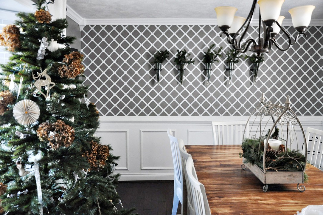
In the dining room above, there were some tricks that I used to help with color selection. Originally, this room had no openings to other rooms. There were doors on all sides and the room was very dark.
The first thing I did was remove the doors to allow some natural light to filter in from adjacent rooms. Next I chose a deeply hued paint color (Farrow and Ball's Mole's Breath) for the trim and chair rail, and we added the wainscoting for interest. I wanted a pale color on the top (as you can see, I broke all rules about rooms without good natural lighting and wanted white). I figured that my white choice on top would be helped out by the deeper color below. I also chose a semigloss paint (Perfect White by Valspar), which I typically don't suggest for walls, but the gloss has more shine in it and I figured that would help throw the color around (we will discuss what sheen to use and where in a future color series post). Finally, I changed out the light fixture, which doubled the light in the room. All in all, the room turned out great and I used lots of smaller tricks to achieve the look I wanted in a difficult space.
“Color is my day-long obsession, joy and torment.”
This quote by Mr. Monet can sum up how difficult color selection can be. We can find ourselves deeply moved by a color, so excited to put it up on the wall, only to find that the same color ends up being a thorn in our side just a short time later. You and friend might look at the same color and disagree about how it looks, simply because you are processing it differently. Needless to say, it is more complicated than it seems like it should be!
Finding the right color will make your home the best place for you, so taking the time to look at it throughout the day and considering the natural lighting is one of the most important things you can do to ensure you are pleased with your selection once it hits the wall. These are just guidelines; you'll have to look at your own space and determine what works best for you; hopefully they should at least save you time, money, and energy in the process!
Have you ever been surprised by how lighting changed the paint color in your room? Was it a pleasant surprise? Have you argued over a color shade with a spouse or friend? Did I miss anything? What have you learned about the lighting in your house? Has it changed your paint selection? I'd love to know!
- Casey

HOLIDAY PARTIES WITHOUT THE WORK
Throw an amazing holiday party without the work

I love parties. I love going to them, throwing them, and decorating for them. I love all of it. My kids and I love all the fun design, planning, staging, and creation that goes into throwing a great party. We love to open our home and invite our friends and family to enjoy the party that we create. We love it all.
Enter the holidays....enter the time crunch.
While I love throwing parties, including throwing parties during the holidays, I know that life can get hectic and there is not always time to create a party at home. It might be the fact that you cannot get the house in order, cannot plan all the events or assemble all the pieces that make your typical parties so fun. Sometimes, there just is a time shortage.
Enter: Gathered Marketplace.

For those of you that are unfamiliar with Gathered Marketplace, let me educate you. Created by two lovely women here in Fayetteville, Amanda Elias and Meagan Riggs, their mission is to grow togetherness between people in our community. Whether that be through a personal party or a community event, they are refocusing our time to what matters most: being with one another.
Gathered Marketplace can plan and throw your holiday party (or any get together!). They can help you figure out a location (which doesn't have to be your home but it CAN be!), a theme, and even activities. I am not referring to your typical party games. These ladies are full of creativity and they can create workshops, projects, and more for you and your friends. You don't have to think of anything - Gathered can figure it out for you.

One recent event they hosted was a workshop on making your own Magnolia Garland. What a perfectly southern thing to learn! Friends gathered, enjoyed wine and appetizers, and learned a new skill, all while spending precious time with one another. I recently attended an event organized by Gathered and a friend. Our workshop was on making floral leis. We had a luau to attend the following day, and we arrived with our freshly created carnation leis from our Gathered workshop. Not only were the leis gorgeous, we were able to learn a new skill while spending time together at our Gathered event.


Gathered Marketplace works with local farmers to source incredible fresh florals and greenery. Each time they create a floral event, you can be sure that the floral stems and greens will delight. However, their expertise is not limited to florals, but believe me, you'll want to try to include them if you can.


If you still feel like a party is just too much, you can attend one of Gathered Markeplace's many pop-up events. One of my favorites was the evergreen pop-up shop that they just hosted at Leclair's General Store (which is amazing and will be having its own post shortly - check them out!). There these talented ladies provide us with fresh floral stems, seasonal arrangements, and more. You can meet your friends there, enjoy the time with one another, and knock out some holiday decorating in the process. The options are endless!

Allowing someone to help you plan your holiday party (or any party) might feel defeating at first; perhaps a feeling that you could not "do it all". However, once you have Gathered step in, you'll have so much fun that you might never turn back. Not to mention the fun your friends will have - they will likely request more of such events in the future! Beyond parties, I know I contemplated just having them stop by to decorate my house with fresh greenery for Christmas; they'd probably agree to that if you asked with a little southern charm!


If you are not lucky enough to live in Fayetteville and have Gathered Marketplace to serve you, then be sure to check out what might be available in your community. Enlisting help can save you a lot of headache and stress, and you'll still be able to enjoy those moments you crave with friends and family. I know that Gathered Marketplace does a beautiful job helping to create those memories. If you have not attended one of their events, grab a few friends and get there. You won't regret it!
Have you attended a Gathered Marketplace Event? What did you think?
- Casey
Workshop Photos by Jamie Pope Photography and all other Magnolia styling photos by Lola V Photography; Evergreen photos by Light and Cedar Photography Co.

CUSTOM WALLPAPER FOR FREE
Free DIY Custom Wallpaper wall using materials you probably already have!

YIPPEE!! I love free things (and I cannot imagine I am alone on this!) There is nothing more satisfying than getting a large bang for your buck and this project has such a great return that I just had to give you the inside scoop. I am going to give you a quick run down on a project that I did a bit back. I should have made an actual tutorial about it, but I had no idea how many people would ask me about it back then. Oh well. I think you can catch on fast, right?!

This wall in my home is painted, not wallpapered. I did not want the hassle and commitment of wallpaper when I decided to add a feature wall to this room, but I knew I wanted some level of impact beyond just paint. So, I figured I would paint my own wallpaper.
To do this, there are several sites that sell laser cut patterns and graphics, but most of them are $20-80 dollars each for the pattern and I could not find the diamond pattern I was dreaming up. Plus, I did not want to commit to the money or the shipping time and wait for the pattern (when I get an idea, I become QUITE impatient).
So while I was contemplating a lot of things (like making my own stencil...probably a bad idea), I also realized it had been awhile since I changed the air filters in our home (I know this is scattered, but this is how my brain works). As I got the filters out, I noticed a hidden gem....my pattern! Yup. I was so excited! There it was, perfectly thick, laser cut and uniform, the back side of my air filter contained just the pattern I was looking for! Even better, I was about to throw the gross part of the filter out, so I just quickly cut the back of the filter off and there was my pattern. SUCCESS!

You can buy this here from Walmart
I knew I could just tape the pattern to the wall with painter's tape, trace the pattern, reposition it again, trace again, and so on until I finished tracing the pattern on the wall. Then I would just use a little tiny paint brush to fill in the gaps with paint that I already had from doing the trim in that room. Brilliant! I figured this project would take me about four hours.
This is where the story comes to a screeching halt. Enter my husband. He asks me what my plan is, and I explain my brilliant idea. He likes the idea, and then asks me how long I think it will take (which, by the way, he always does because he has an incredible sense that can identify when I have completely lost touch with reality). I promptly reply it will take me four hours. He replies, "Four hours today? How many tomorrow?" I was shocked that he would doubt my timeline. I was certain that this project would possibly take me more than four hours.

You know where this is going. In my defense, the project did take me four hours, three times :) It was a little (LOT) more time intensive than I realized (score yet another point for my husband), but oh my, have I loved the results. A couple of points that I learned in doing this:
1. Your walls might not be fully level, so I had to fudge some areas to make sure they were good enough.
2. Plan for two coats of paint. After the first coat of paint, I realized it was going to require a second to really look right (that was a depressing moment).
3. Imperfection is part of this project. Accept it (or potentially go crazy as an alternative...although when you see the doctor and you start explaining what you are doing, you will probably get that diagnosis anyway). Most people tell me I am crazy for a lot of reasons, though, so that is nothing new for me.
In the end, the 12 hours was totally worth it. Not only did I not have to mess with trying to wallpaper old and uneven walls, but there has been no seam weakening or peeling like you can get with wallpaper over time. Plus, the project did not cost me a dime. Even if you have to buy everything new, you can pick up all the materials for less than ten bucks. Not bad for a lot of impact.
Remember, it seems a little crazy for some, but this project is super forgiving. You don't have to be perfect for it to look nice. No one is going to stick there face right up into and see if you have a little shaky hand brush stroke someplace (and If they do, then maybe they are not really your friend :) People will think it looks amazing, even if imperfect!

Perfectly imperfect
It was truly that simple. I wish I had more "how to" photos to show you, but it honestly was just taping the pattern to the wall, tracing with a pencil, and then painting it in.....plus a whole lot of patience.
Will you give it a try??
Casey

CREATING A WALL GALLERY
How to create a wall gallery without making your home look like a flea market.


“I begin with an idea and then it becomes something else.”
This post was inspired by my sister-in-law Angela, who is a newlywed and has recently bought a beautiful home in Washington, DC. She is very well travelled and has collected beautiful treasures from across the globe. Her husband is also a traveler, and has done the same. Together they have an amazing collection of beautiful things. In trying to display them, she asked, "How do I create a wall gallery without making my home look like a flea market?" This made me laugh, and equally smile because I know her house would never look like a flea market.
She raised a good question, however, so I thought about it for awhile and I realized that I had never really created a "formula" for a wall gallery. I have always just done it how I liked it. When I started to think about it, though, I realized that there are a few key components or building blocks that translate into an attractive wall gallery that doesn't look like a flea market.
I like to start with a larger space, and one that doesn't have a lot of business (pattern and or color) going on. I feel that wallpaper or prints can compete with items you are trying to display, and then things end up looking visually messy. Think of an art gallery. They are typically displaying art against a stark white background. The white background or light background allows us to focus on the art itself, rather than the wall behind it; it removes any confusion.

Before I put anything on the wall, I lay everything out on the floor or make a quick sketch of my items. This helps me get a glimpse of how things might look on the wall, without being committed to making a bunch nail holes before I have a plan (not that I don't LOVE filling nail holes - who doesn't?) It's funny how most things go better when there is a plan, right? I won't pretend I have not just flown by the seat of my pants with galleries before (I am quite known for that habit), but most of the time, things go better when I take the time to think it through first.
Next I consider scale of the wall and scale of my items. If you have a larger item, or two larger items, you typically want them centered or at least balancing each other side to side. Even if they are different shapes, their size will balance well when they are positioned against each other. After I have decided on my central item, I look at what else I want to display with it. Then I group them into similar sized or shaped items as well. That way I know how to balance each of them, splitting them up into a few groups. When you have done that, you can start placing them around your larger items, looking at balancing each side of the gallery with similar sized or shaped things on either side of the larger items.

Once you have decided on a grouping you like, think about how you might be able to add some uniformity to the situation. For example, you can hang all sorts of things, but you might consider putting them all in black frames for unity. You could also decide to make everything very colorful. Perhaps a few things on each side are in frames, and then a few things are word art, and then a few things are objects. Mostly you want to create some level of balance between the items.
Next you need to decide how much "white space" you want between your items. This would be how closely things are hung together. It can look cool to have things placed nice and snug if they are more uniform (like the example of everything in black frames). If your items are more eclectic, you might want to consider wider spacing to allow the eye to really focus on the object itself as part of the wall gallery, rather than it looking too cramped and messy.

In this photo, all the papers are different sizes and colors, but the gallery is unified by the same clip holding each piece. The clips are also equally spaced which gives balance, despite the fact that all the papers are different. Note the white back ground allows you to see the clips and the papers.
Finally, you need to look at the overall shape and size of your wall and your gallery creation. If the wall is just rectangular, you have a lot of options. Consider the furniture as part of the gallery; it can define the edges and does add into the equation. A popular location for a wall gallery is a stair case. This is a little trickier as the wall is angled with the stairs. In this case, you just follow the angle of the steps with your art. When you do this, you create a pleasing visual along the stairs that carries with the lines of the steps. Balance is achieved and your eyes are happy!


This is a stair gallery in our house. Hard to grab a photo of this, but the angle of the bottom pictures is going along the stair line. Everything is in a white or black frame to give balance. Objects that are not framed are balanced with those that are.

Showing it from a different angle.
It takes some trial and error, but eventually you get a sense that tells you it looks balanced and attractive to the eye. If you are still not confident enough to put it on the wall, you can use painter's tape to tape out the shape and size of your objects and put it all on the wall first. This is also very handy for identifying where your positioning and nails should go (as long as you take the time to accurately measure things). It is time consuming, but can really be helpful in the end.
Hopefully I have helped answer the question of the wall gallery, Angela. The most best part of a gallery is that it can be change in rotation. Things can go on and come off and it will instantly change the look of the gallery with very little time and effort. I love doing that at the holidays. I will often change out a wall gallery that includes fresh flowers or a wreath, and will change out the flowers and wreath for the season we are in. It's a quick change that updates everything quickly and didn't take more than a few minutes and hardly cost anything.
“Imperfection is perfection to a beautiful perspective.”
When it comes to hanging things in a gallery, just keep playing with it until you love it. I think it is a great way to display things you love and fill your home with your unique story.
Have you created a wall gallery in your home? Did you like the result? Was it hard to achieve? Did it feel like a flea market? :)
-Casey
Choosing Paint Colors - Part One - Evaluating the Undertone
How to evaluate an undertone to be sure you'll like the color on the wall.
Why is choosing paint colors so difficult?
This is a question that seems to frustrate many clients, homeowners, and decorators. Just when you think you have it figured out, it goes up on the wall, and SURPRISE, it is nothing like you envisioned. Back to the drawing board.
I am with you. I have struggled with paint colors for many years. After thinking I had a fool proof plan or color, I would be excited to put it in a new room, only to see the color behave differently. There had to be a better way to evaluate my color before putting it up on the wall.
I found the common theme of my mistakes was that I had misjudged the undertone of the color. Most paints are rooted in a yellow, blue, green, or red undertone. When you start to compare the swatch colors, you can see how a certain shade pulls through. Understanding that you like or dislike certain undertones is critical in deciding what colors will work for you.

Let's take an example. In the photo above, there are several shades of neutral and brown present. In the bark, we have a brown that has a green and blue undertone, and it presents as more of a gray as a result. The background behind the cat has a more yellow undertone, and it presents as a warmer brown. Looking at the back of the cat, and somewhat in the face, you will see a brown that has a more red undertone, giving the brown even more warmth and a reddish undertone. Finally, the cat's fur has a very mild gold undertone, making a very light beige slightly warm brown. As you can see, there are several browns, all of which present as brown, but when you look at each more closely, they have different undertones which come across while altering the shade.
When you have your paint chip samples, you can look at three colors that you are considering, and you can see what undertone appeals to you. Blue undertones will cast cooler vibes to a color, whereas yellow and red undertones will warm things up. Red undertones tend to cast more "santa fe" pink/rustic red cast into their color, and that is something that does not typically appeal to me. However, in my bathroom, because of the lighting (which is another topic we'll discuss), I had to choose a gray that had a red undertone because the marble tile we chose had the slightest bit of red undertone in it. I had missed that at first and had chosen a cool gray (blue undertone - Gray Owl by Benjamin Moore), and it ended up looking Mint Green on the wall! Not at all what I was going for. I was afraid to choose the red undertone gray as I don't usually like those, but it was the perfect choice in that bathroom. Sometimes you have to go with what you see, rather than what you think you want.

In summary, when comparing colors, you have to decide what undertones appeal to you. This is the first step to ensuring you are going to like the color once it gets on the wall. As an experiment, look at the things you already have in that room or in your home. Evaluate the undertones and see what you are already drawn to based upon what is in your home. Additionally, you also ensure that the new color you choose will harmonize with what you already have in the room (it is expensive to have to purchase new furniture and décor just because you repainted!). There is no wrong or right, only what you prefer, and this should start coming through when you evaluate what you already have. If you are struggling, I like to take crayons in the color of red, yellow, green and blue and then put it up against whatever item I am evaluating. Usually, the crayon with the same undertone as the color of the item being evaluated will look the best with that item. That is a little trick to help determine the undertone.
Of course, in my example above, even if you don't think you like a certain undertone, you might find that you have chosen other things with that same undertone. If you try to compete with several undertones in the same space, you'll end up with a mess on your hands. Trying to keep the undertones complimentary throughout the space will unify the space. This is a subtle point, but it is what will make the room pop at the end. People won't be able to place their finger on "why" the room just feels good, but they feel like it is visually appealing. That is likely because the undertones are congruent.
More on color choice will follow, including lighting, paint sheen, choice for neutrals and home rentals, and more. Stay tuned!
Casey