

Choosing Paint Colors - Part One - Evaluating the Undertone
How to evaluate an undertone to be sure you'll like the color on the wall.
Why is choosing paint colors so difficult?
This is a question that seems to frustrate many clients, homeowners, and decorators. Just when you think you have it figured out, it goes up on the wall, and SURPRISE, it is nothing like you envisioned. Back to the drawing board.
I am with you. I have struggled with paint colors for many years. After thinking I had a fool proof plan or color, I would be excited to put it in a new room, only to see the color behave differently. There had to be a better way to evaluate my color before putting it up on the wall.
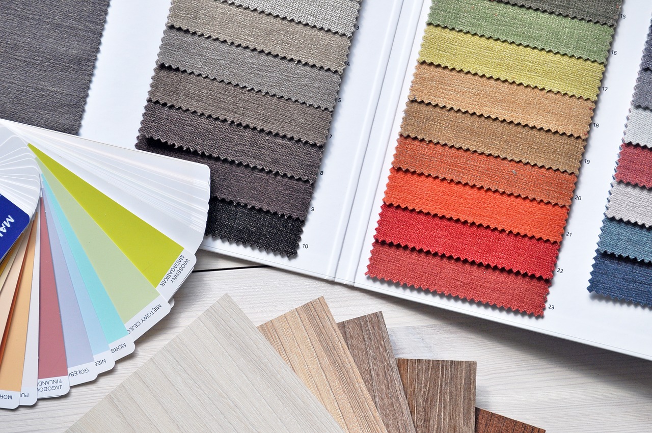
I found the common theme of my mistakes was that I had misjudged the undertone of the color. Most paints are rooted in a yellow, blue, green, or red undertone. When you start to compare the swatch colors, you can see how a certain shade pulls through. Understanding that you like or dislike certain undertones is critical in deciding what colors will work for you.

Let's take an example. In the photo above, there are several shades of neutral and brown present. In the bark, we have a brown that has a green and blue undertone, and it presents as more of a gray as a result. The background behind the cat has a more yellow undertone, and it presents as a warmer brown. Looking at the back of the cat, and somewhat in the face, you will see a brown that has a more red undertone, giving the brown even more warmth and a reddish undertone. Finally, the cat's fur has a very mild gold undertone, making a very light beige slightly warm brown. As you can see, there are several browns, all of which present as brown, but when you look at each more closely, they have different undertones which come across while altering the shade.
When you have your paint chip samples, you can look at three colors that you are considering, and you can see what undertone appeals to you. Blue undertones will cast cooler vibes to a color, whereas yellow and red undertones will warm things up. Red undertones tend to cast more "santa fe" pink/rustic red cast into their color, and that is something that does not typically appeal to me. However, in my bathroom, because of the lighting (which is another topic we'll discuss), I had to choose a gray that had a red undertone because the marble tile we chose had the slightest bit of red undertone in it. I had missed that at first and had chosen a cool gray (blue undertone - Gray Owl by Benjamin Moore), and it ended up looking Mint Green on the wall! Not at all what I was going for. I was afraid to choose the red undertone gray as I don't usually like those, but it was the perfect choice in that bathroom. Sometimes you have to go with what you see, rather than what you think you want.

In summary, when comparing colors, you have to decide what undertones appeal to you. This is the first step to ensuring you are going to like the color once it gets on the wall. As an experiment, look at the things you already have in that room or in your home. Evaluate the undertones and see what you are already drawn to based upon what is in your home. Additionally, you also ensure that the new color you choose will harmonize with what you already have in the room (it is expensive to have to purchase new furniture and décor just because you repainted!). There is no wrong or right, only what you prefer, and this should start coming through when you evaluate what you already have. If you are struggling, I like to take crayons in the color of red, yellow, green and blue and then put it up against whatever item I am evaluating. Usually, the crayon with the same undertone as the color of the item being evaluated will look the best with that item. That is a little trick to help determine the undertone.
Of course, in my example above, even if you don't think you like a certain undertone, you might find that you have chosen other things with that same undertone. If you try to compete with several undertones in the same space, you'll end up with a mess on your hands. Trying to keep the undertones complimentary throughout the space will unify the space. This is a subtle point, but it is what will make the room pop at the end. People won't be able to place their finger on "why" the room just feels good, but they feel like it is visually appealing. That is likely because the undertones are congruent.
More on color choice will follow, including lighting, paint sheen, choice for neutrals and home rentals, and more. Stay tuned!
Casey